Brand Refresh for a Mission-Driven Nonprofit
Quinsigamond Community College Foundation (QCCF)
Branding effort for Quinsagamond Community College Foundation completed fall of 2025. LightDark Creative Agency was pleased to submit a proposal for the Quinsigamond Community College Foundation (QCCF) Brand Refresh. As a woman-owned creative studio based in Central Massachusetts, we specialize in branding for mission-driven organizations. We are excited by the opportunity to partner with QCCF in refreshing its visual identity to more effectively engage donors, alumni, and the broader community.

Concept Definition
Origami
Transformation through care - Origami begins as a simple sheet of paper and, through deliberate folds, becomes something intricate and meaningful. This mirrors how the Foundation transforms resources into opportunities for students—turning financial support into futures, growth, and impact.
Growth and possibility - A folded crane, flower, or structure symbolizes hope, progress, and potential. Likewise, the Foundation invests in students who may begin with modest means but, with support, unfold into their full potential.
Precision and craft - Origami is about intention, precision, and thoughtful design. It suggests that the Foundation approaches its work with care and purpose, ensuring resources are used wisely to shape strong outcomes.
Visual Connection to QCC’s Brand- The existing QCC logo already has a geometric, folded-paper look. Building the Foundation’s “F” as if it were folded from origami paper would visually unify the two identities, while also layering in the metaphor of growth and transformation.

Why it mattered
Foundations speak to donors—not students. QCCF needed a visual identity that aligned with the college brand while clearly signaling a distinct mission focused on philanthropy, alumni, and community impact.
The challenge
Differentiate the Foundation from the academic institution
Modernize the brand without alienating legacy supporters
Create a system flexible enough for campaigns, print, and donor materials
Design approach
LightDark framed the strategy around “siblings, not twins.” Through discovery and competitive analysis, we developed logo concepts that echoed the college’s credibility while standing independently.
Deliverables included:
A complete logo and visual identity system
Print-ready stationery and digital templates
Clear usage guidelines to support internal consistency
Impact
Clarified the Foundation’s role and audience
Improved visual alignment across donor communications
Delivered a future-proof system for campaigns and fundraising initiatives


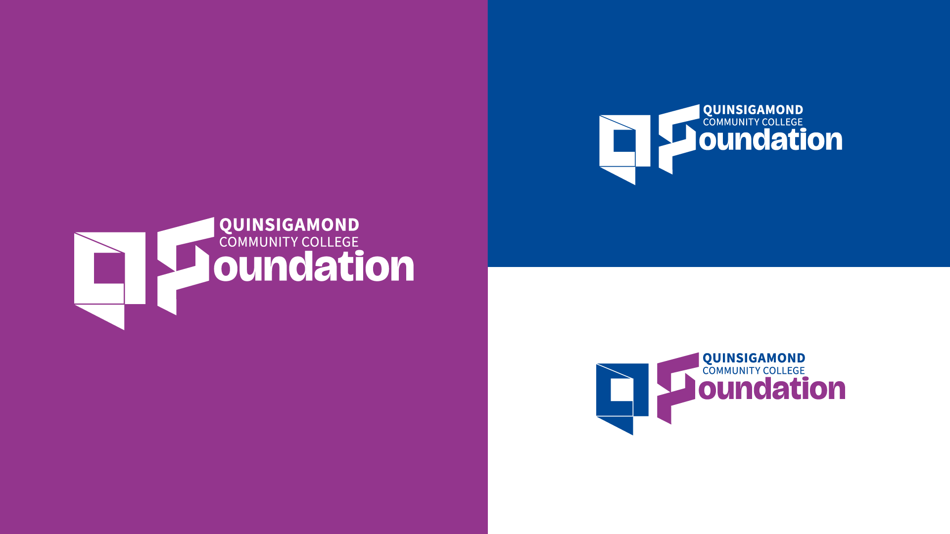
"Siblings not Twins"
What we heard & approach to problem solving
QCC Foundation’s initiatives reach a very different audience than the academic institution; and that group needs an on-brand logo that reflects the dedicated support that the board does, while being distinctive in its own right. Afterall, marks in a system can be siblings - not twins.
Concept Exploration
Samples of the four initial logo concepts and brand swipes
Concept Definition: Origami
Transformation through care - Origami begins as a simple sheet of paper and, through deliberate folds, becomes something intricate and meaningful. This mirrors how the Foundation transforms resources into opportunities for students—turning financial support into futures, growth, and impact.
Growth and possibility - A folded crane, flower, or structure symbolizes hope, progress, and potential. Likewise, the Foundation invests in students who may begin with modest means but, with support, unfold into their full potential.
Precision and craft - Origami is about intention, precision, and thoughtful design. It suggests that the Foundation approaches its work with care and purpose, ensuring resources are used wisely to shape strong outcomes.
Visual Connection to QCC’s Brand- The existing QCC logo already has a geometric, folded-paper look. Building the Foundation’s “F” as if it were folded from origami paper would visually unify the two identities, while also layering in the metaphor of growth and transformation.

Logo on campus
QCCF “Combo” Emblem logo featured on campus in a rendering of a building awning. Mock up services to sell visuals and allow audiences to better connect with abstract concepts is a service we always offer at LightDark.

Featured at Sponsored Events
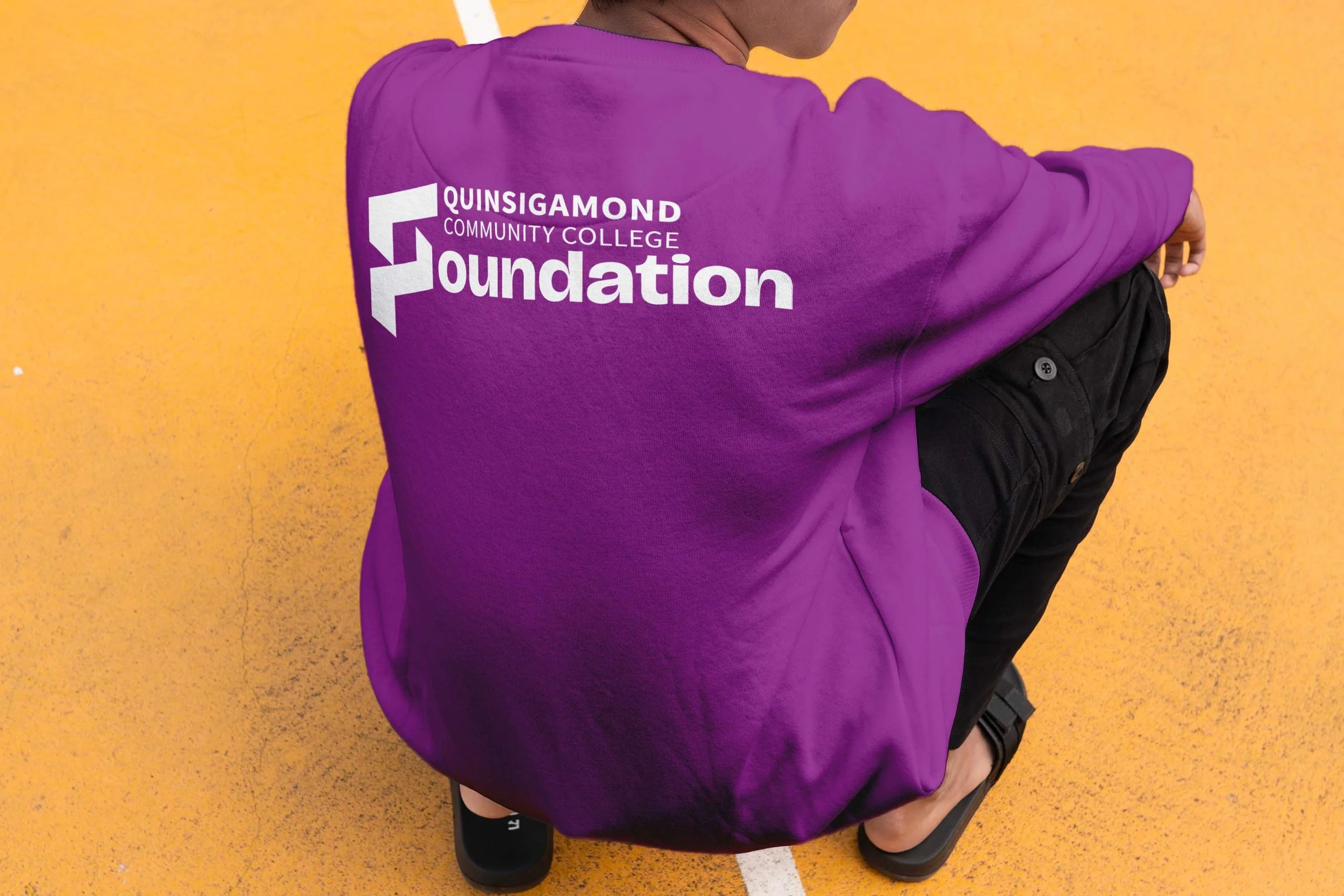
Sporty Crewneck on Male Student on track featuring QCCF Logo


Featured on Letterhead
QCCF Logo featured on Letter Head and with Business Cards
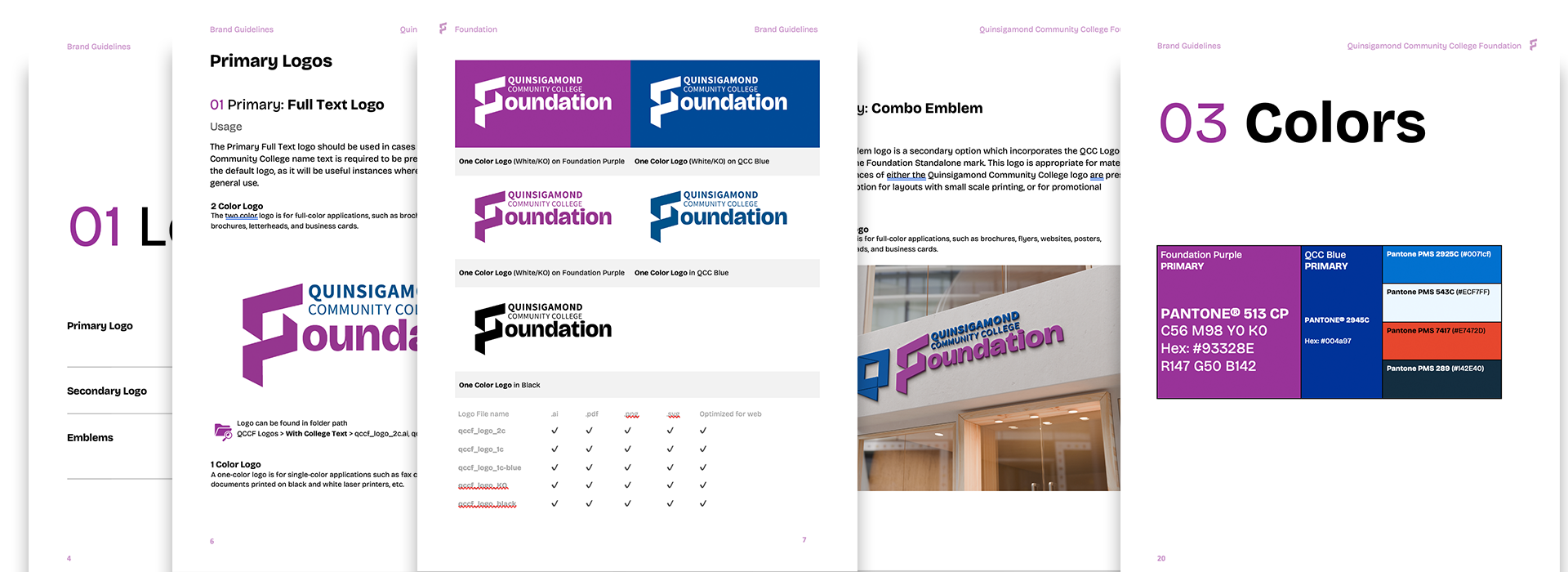
Style Guide


