Appelation
Luxury Product Packaging System for Multi-Collection Launch
For Appellation, packaging is not secondary—it is the product experience. As the brand expanded into new categories—oil burners, body oils, and incense—the challenge was to create packaging that felt ritualistic, tactile, and enduring, while remaining practical for production across international printers.
This work needed to balance emotional resonance with manufacturing precision.
The Challenge
Appellation’s expansion introduced several layered constraints:
Multiple new product lines launching on tight timelines
Luxury expectations around materiality, texture, and restraint
FSC-certified paper requirements with no prior standard selected
Complex production needs: dielines, Pantone matching, debossing, and silk printing
Packaging that could scale into future bundles and discovery kits
The risk wasn’t visual inconsistency—it was breaking the ritual through poor execution.
Design Approach
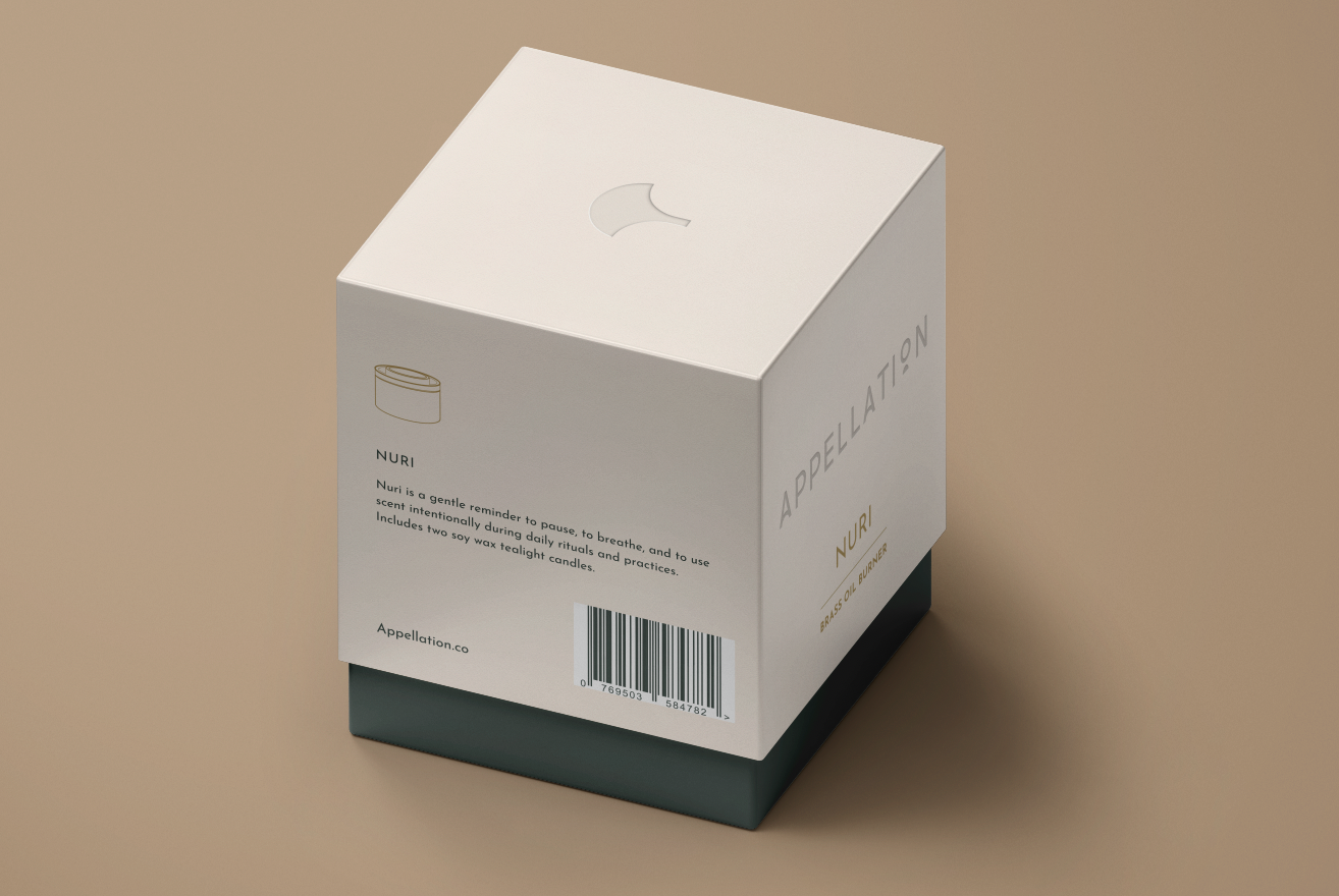
Oil burner packaging as a reusable system
For the Nuri and Ember brass oil burners, we designed a telescoping rigid box system that could support future products using the same form factor.
Reverse-engineered wrapper dielines for chipboard boxes
Developed inner and outer wrap designs with debossed brand messaging
Ensured flexibility for alternate contents (candles, oils, discovery kits)
Body oil packaging as a collection narrative
For Appellation’s first skincare products—ISHQ, BAHI, and NA’IM—we explored packaging as a triptych: three boxes that visually align side-by-side to form a woman’s neckline.
Single-color silk-print artwork for Miron violet glass bottles
Coordinated outer cartons with refined color stories
Designed to resonate culturally with the Arab market while remaining contemporary
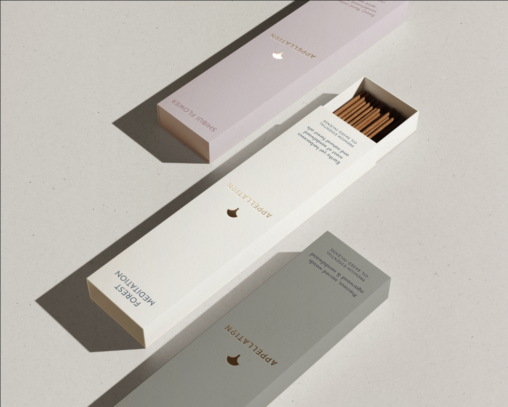
Incense as ritual object
For Appellation’s first incense collection—crafted in collaboration with artisans on Awaji Island, Japan—we designed packaging that honored time, craft, and restraint.
Drawer-style rigid box concepts
Earth-toned palettes and textured FSC papers
Subtle use of embossing and line work to suggest ceremony rather than decoration
Production-ready execution
Across all products, LightDark delivered:
Print-ready artwork with bleeds and Pantone specifications
Debossing layers and printer instructions
FSC paper recommendations aligned with luxury tactile standards
Digital proofs coordinated with international printers
The result was packaging that felt intentional, not disposable.
Impact
Enabled simultaneous launch of multiple new product categories
Established a scalable packaging system adaptable to future collections
Preserved Appellation’s luxury positioning through material and production discipline
Reduced friction between design intent and real-world manufacturing
This project reinforced Appellation’s brand promise: scent with intent—expressed through form, texture, and craft.