Museum of Serial Killers
The Museum of Serial Killers is a new institution dedicated to investigating, evaluating and unraveling the psychology of American serial killers. The exhibits are curated and designed to walk the viewer through the mentality and the rituals of the murderer. The viewpoint is to showall aspects of the serial killers’ psyche, and how they begin as an average person, and how thereis a break in the psyche, because of which they grow into emotionless sociopaths and psychopaths.
MUSEUM of SERIAL KILLERS: Museum Concept & Branding
At the end of Graphic Design IV with Lisa Rosowsky, we were given an assignment sheet with the title Museum X, and it said that we could come up with the branding, interior signage, website, and advertisements for a museum on the topic of our choice. Wary of doing yet another project involving shoes, I decided to explore a darker topic: serial killers. Although I have always found the topic interesting, I realized that I didn’t have a lot of information about it off hand, and so began a twenty-hour marathon of pure research into the general definition, trends, case studies, and psychology of American serial killers. This particular assignment highlights my passion for learning and research, a part of design that I hope to work in heavily in my professional life.
Concept: Using Subtlety as a Mechanism
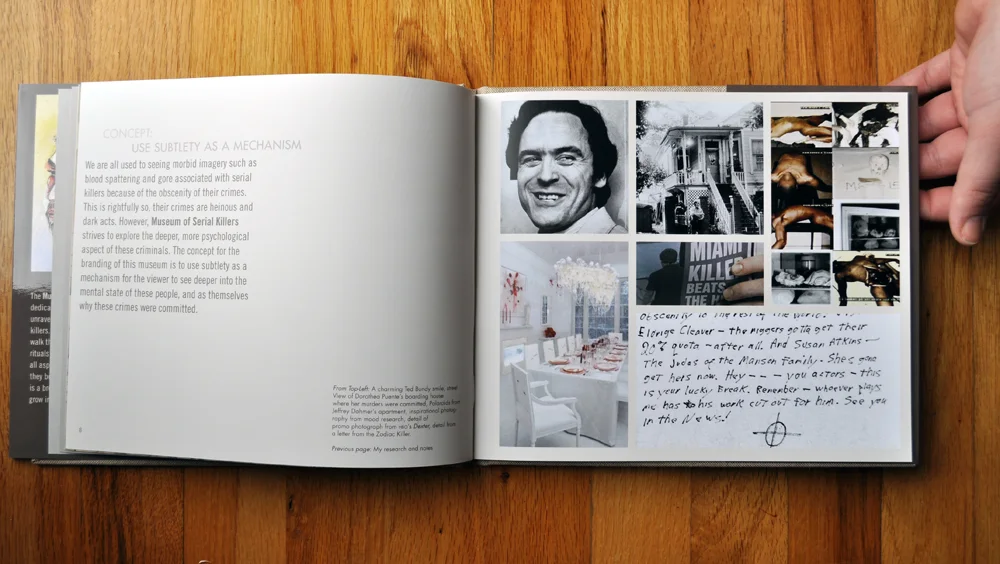
We are all used to seeing morbid imagery such as blood spattering and gore associated with serial killers because of the obscenity of their crimes. This is rightfully so, their crimes are heinous and dark acts. However, Museum of Serial Killers strives to explore the deeper, more psychological aspect of these criminals. The concept for the branding of this museum is to use subtlety as a mechanism for the viewer to see deeper into the mental state of these people, and as themselves why these crimes were committed.
Conceptualizing the Experience
While researching this topic, I noticed patterns in the psychoanalysis of each serial killer, the sequence of events leading up to the strings of murders, and the private lives of the perpetrators. I noticed that each of these people had a deep-rooted personality flaw derived from a specific type of mental disorder (i.e. schizophrenia or sociopathic tendencies) or an abusive figure in their adolescence. Thus, from my research came my design solution: to explore the psychological workings of serial killers, from the general psychoanalysis to the ritual of the kill, and use that perspective to drive the branding and exhibit outline for each type of killer. In my logo design I used a typographic mark incorporating a slash which represents the psychological break in the personality, or in the words of Dexter, “the dark passenger” of the person who became a serial killer. I expanded on the concept of the division of personality and used it as a visual element to show more or less content in the interior signage, billboard advertisement, and as an expanding window in the header of the website.
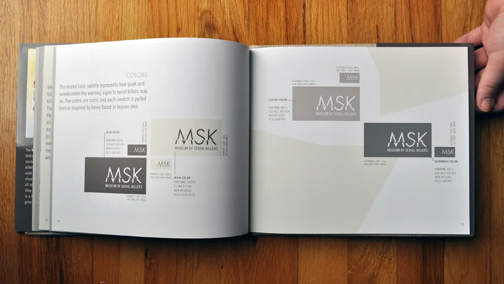
LOGO & GUIDELINES
In the branding, a slash is utilized to represent the break in the serial killers personality: to explore the concept of having a “dark passenger.”
Unconventional Imagery
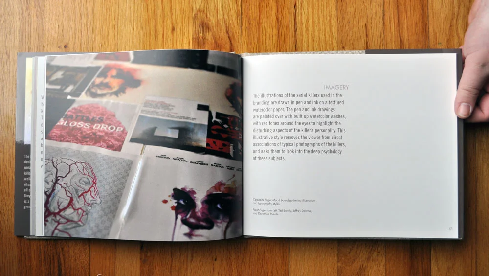
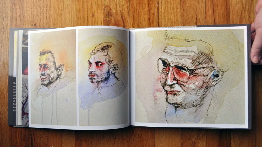
I had known from the time that I chose this topic that I didn’t want to design a typical horror-and-gore type of establishment, and I wanted to avoid typical imagery such as blood spatters, dark colors, grungy textures, and metalband typefaces. Instead, I chose to use a lighter, muted color palette inspired by skin tones, I illustrated portraits of the exemplary serial killer for each exhibit in pen and watercolor, compiled signatures and quotes from the headlining serial killers, and utilized crisp typography to give the viewer a deeper sense of the person behind the macabre mask that the media presented to the world at the time of their trials.
Colors
The muted color palette represents how quiet and unnoticeable the warning signs to serial killers may be. The colors are calm, and each swatch is pulled from or inspired by tones found in human skin.
Developing Illustrations & Statement
The Museum of Serial Killers is a new institution dedicated to investigating, evaluating and unraveling the psychology of American serial killers. The exhibits are curated and designed to walk the viewer through the mentality and the rituals of the murderer. The viewpoint is to show all aspects of the serial killers’ psyche, and how they begin as an average person, and how there is a break in the psyche, because of which they grow into emotionless sociopaths and psychopaths.
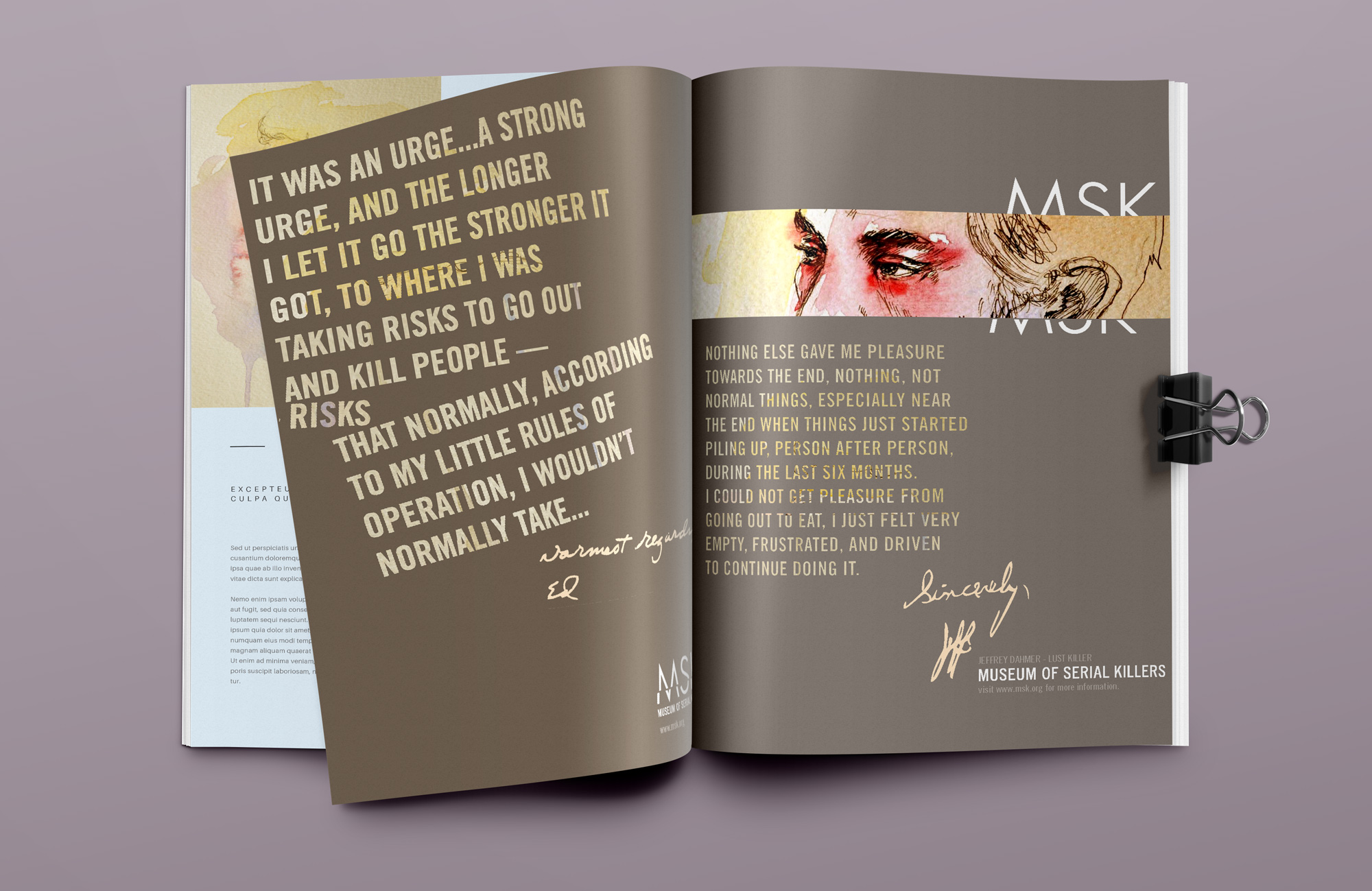
Printed Application
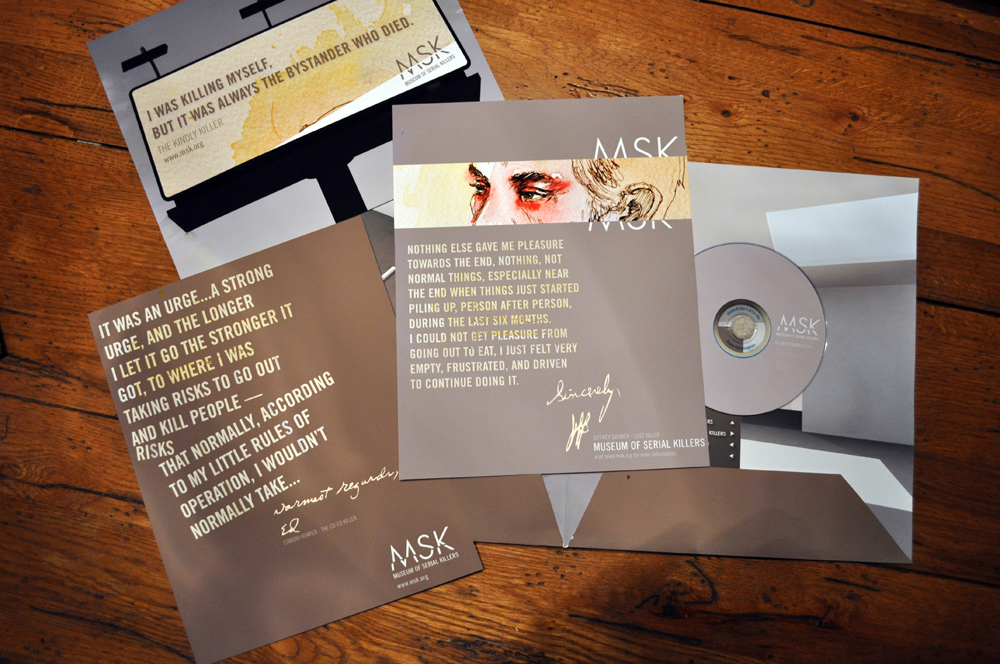
The images in this spread are examples of printed advertisements to be featured in magazines.
The logo is allowed to be broken along the slash line for composition in collateral such as signage, web, and print advertising.
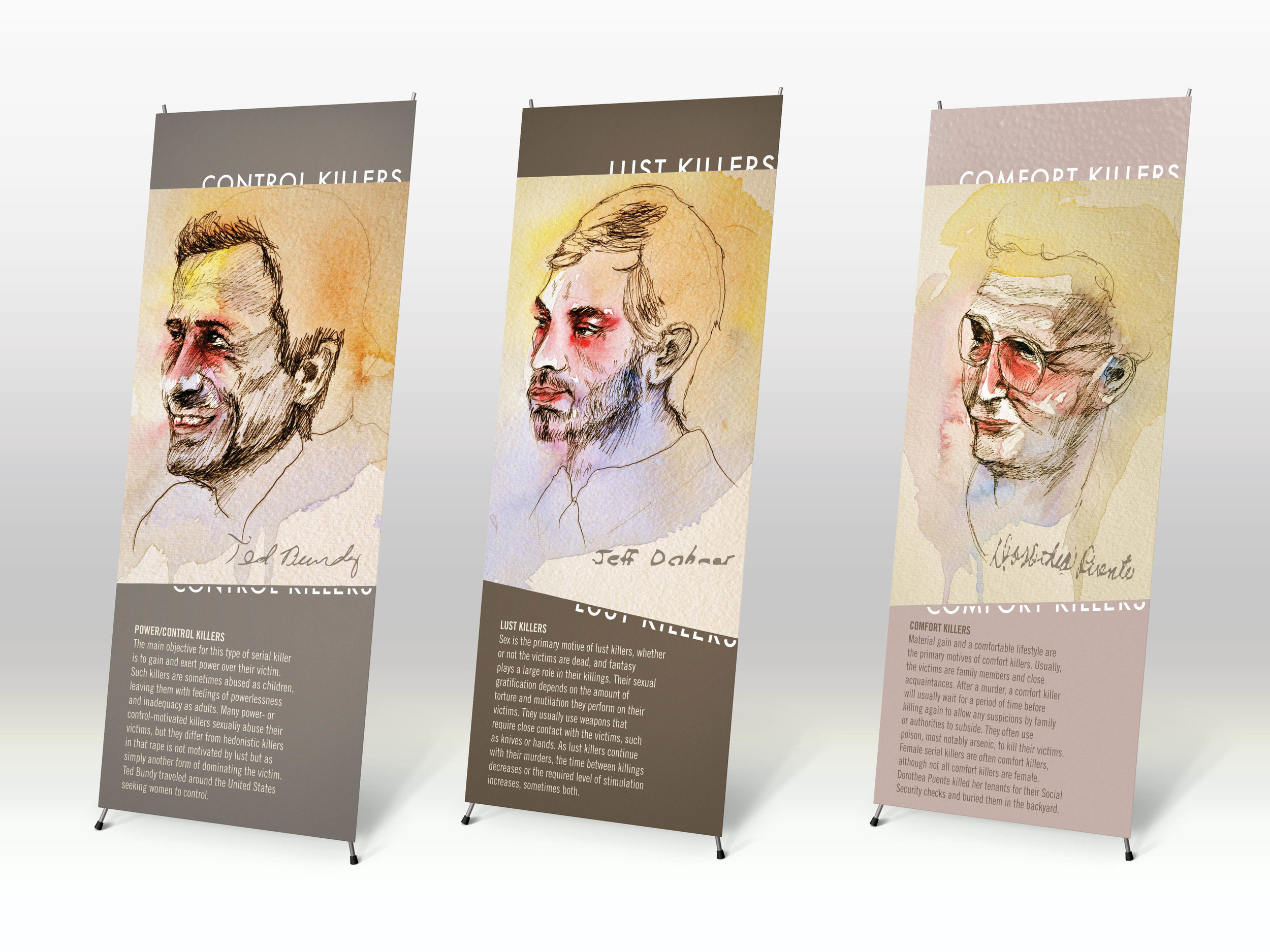
Interior Signage
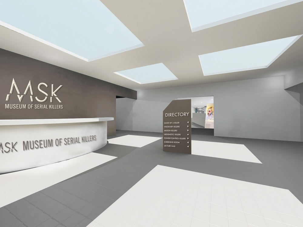
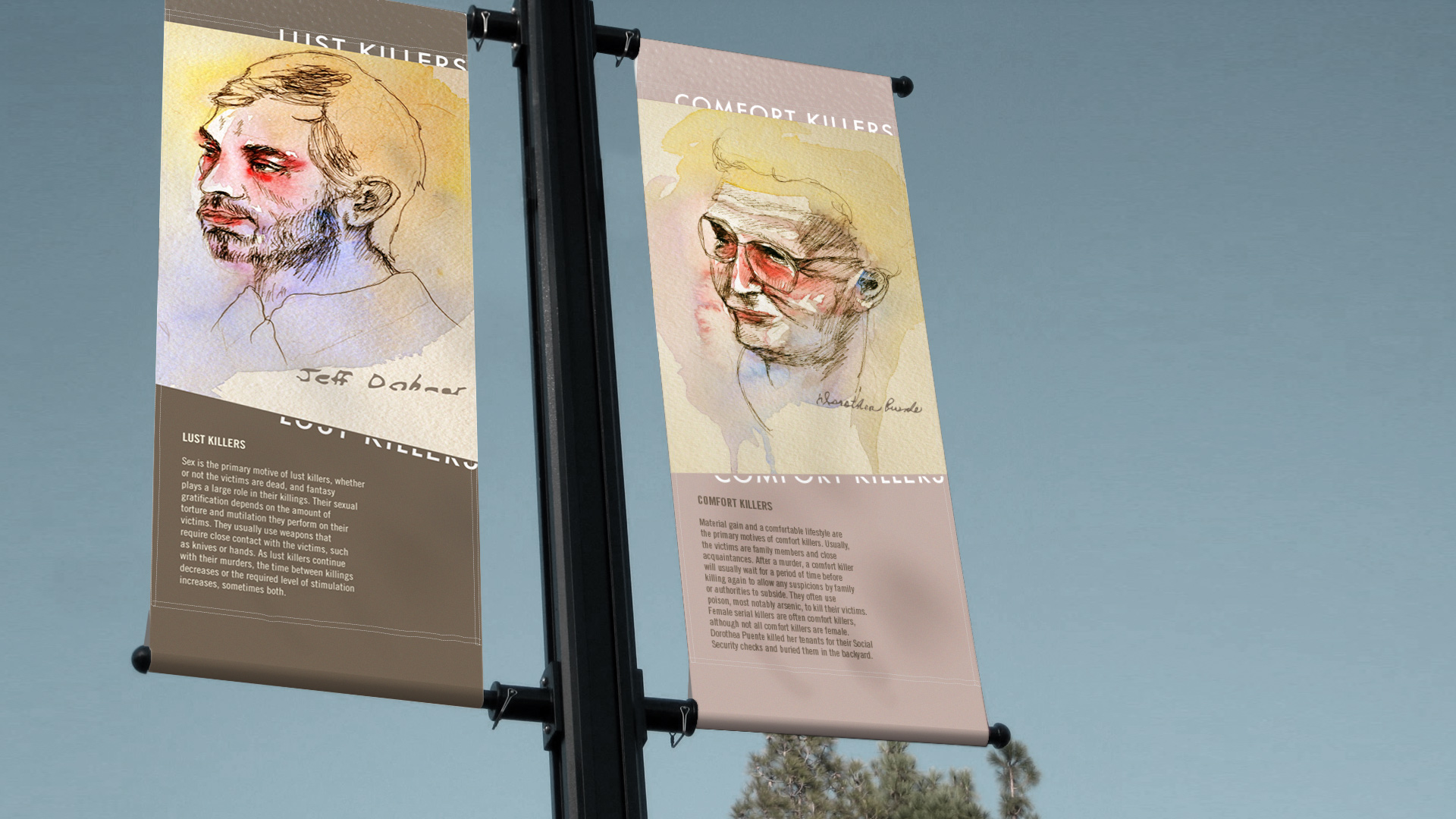
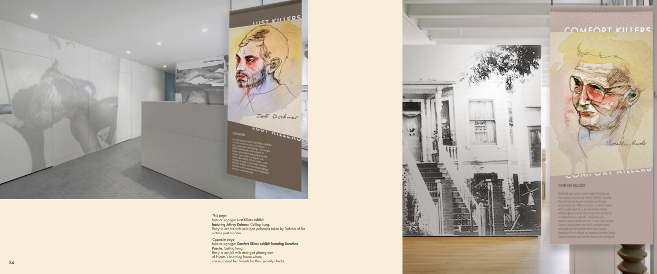
Interior signage will feature one ‘headlining’ serial killer per exhibit, which is broken down by kill motives. These motive categories are Power/Con- trol, Visionary, Mission-Oriented, Comfort, Thrill, and Lust. The three examples shown are Power/ Control, featuring Ted Bundy; Lust featuring Jeffrey Dahmer; and Comfort featuring Dorothea Puente. All banner signage will be suspended from the ceiling at the entrance to each exhibit.
Exterior Signage & SIgnatures
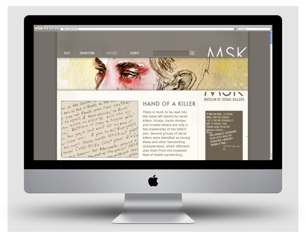
Signatures are also utilized in this branding to show more depth in personality through existing research and analysis of serial killer handwriting, showing the common attributes of serial killer handwriting versus stable-minded handwriting. The addition of this personal touch also serves as a reminder that these killer are human.
Exhibition Design & Purpose
This page
Interior signage: Lust Killers exhibit
featuring Jeffrey Dahmer. Ceiling hung.
Entry to exhibit with enlarged polaroids taken by Dahmer of his victims post mortem
Opposite page
Interior signage: Comfort Killers exhibit featuring Dorothea Puente. Ceiling hung.
Entry to exhibit with enlarged photograph
of Puente’s boarding house where
she murdered her tenants for their security checks
Web Identity
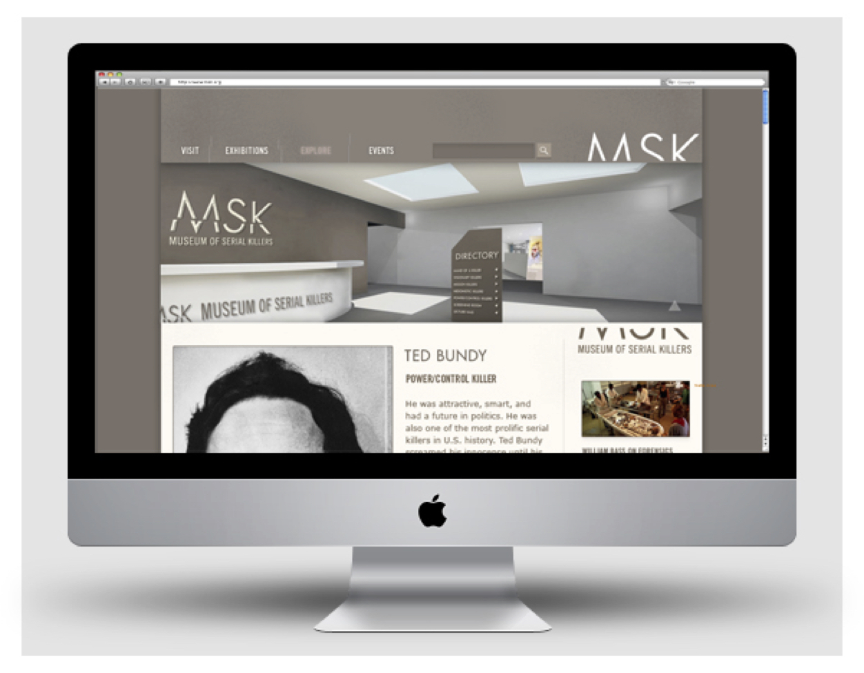
The Museum of Serial Killers website is an example of where the logo can be broken along the slash line. This separation frames a headline image that can be expanded to reveal more of the image. This allows viewers to ‘see more deeply’ into the subject.

