
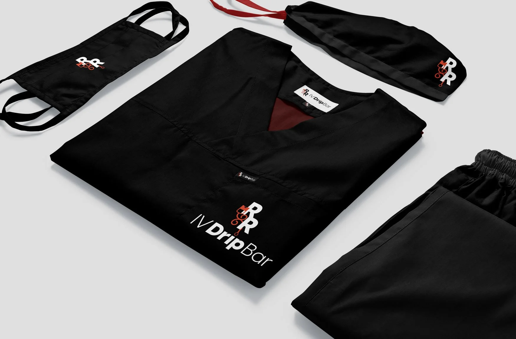
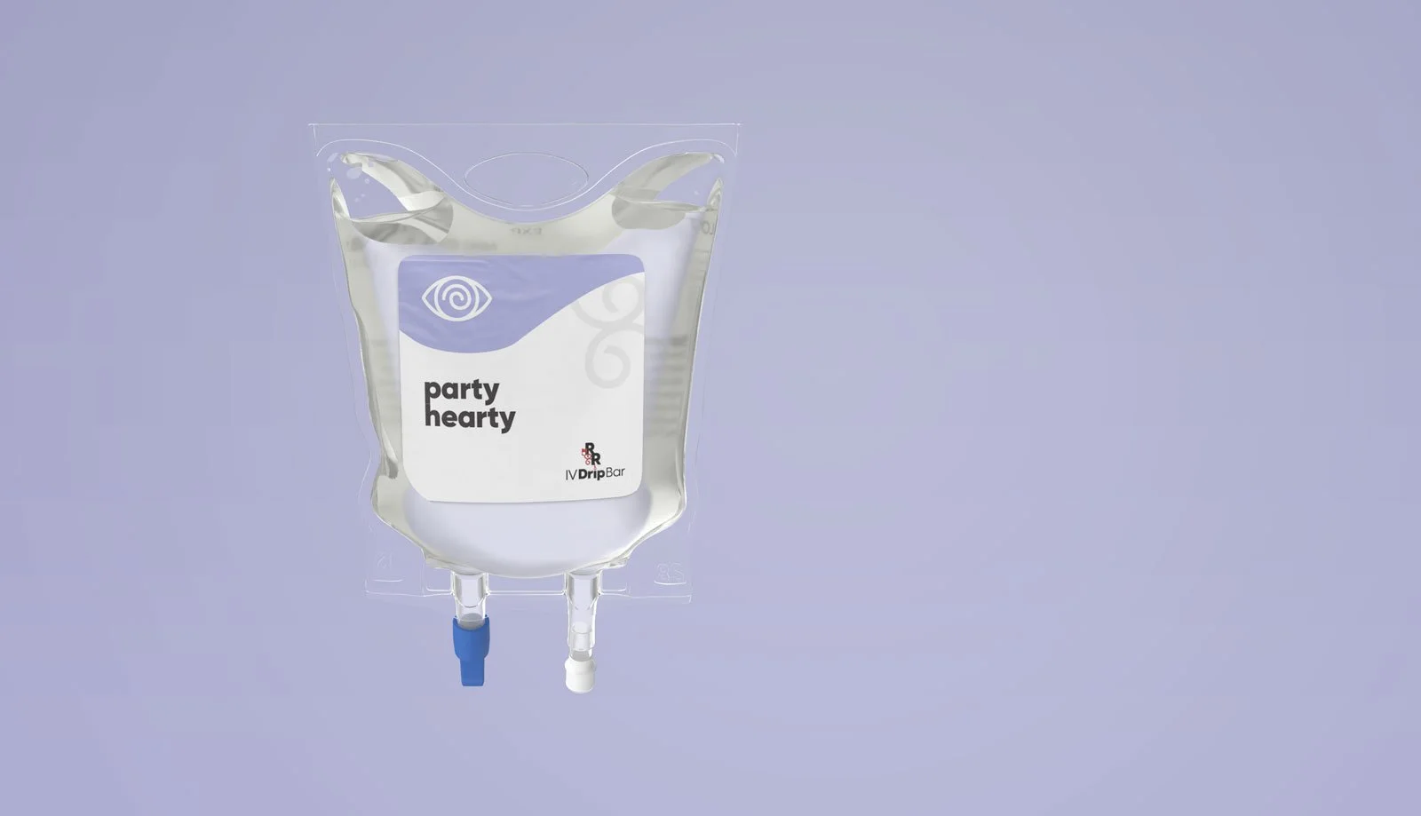
R&R IV Drip Bar
We recently collaborated with a small yet ambitious start-up IV business that features a well-credentialed ex-nurse and her dedicated emergency response partner. Together, we worked closely to develop a distinct and memorable brand identity that could be effectively translated across various platforms, including physical signage, the company’s website, and their social media channels. In addition to this, LightDark also took on the responsibility of designing and managing the website, which now includes integrated scheduling services for the convenience of their clients.
We recently collaborated with a small yet ambitious start-up IV business that features a well-credentialed ex-nurse and her dedicated emergency response partner. Together, we worked closely to develop a distinct and memorable brand identity that could be effectively translated across various platforms, including physical signage, the company’s website, and their social media channels. In addition to this, LightDark also took on the responsibility of designing and managing the website, which now includes integrated scheduling services for the convenience of their clients.


BAA Foundation | Link Tree, Custom Web Solution
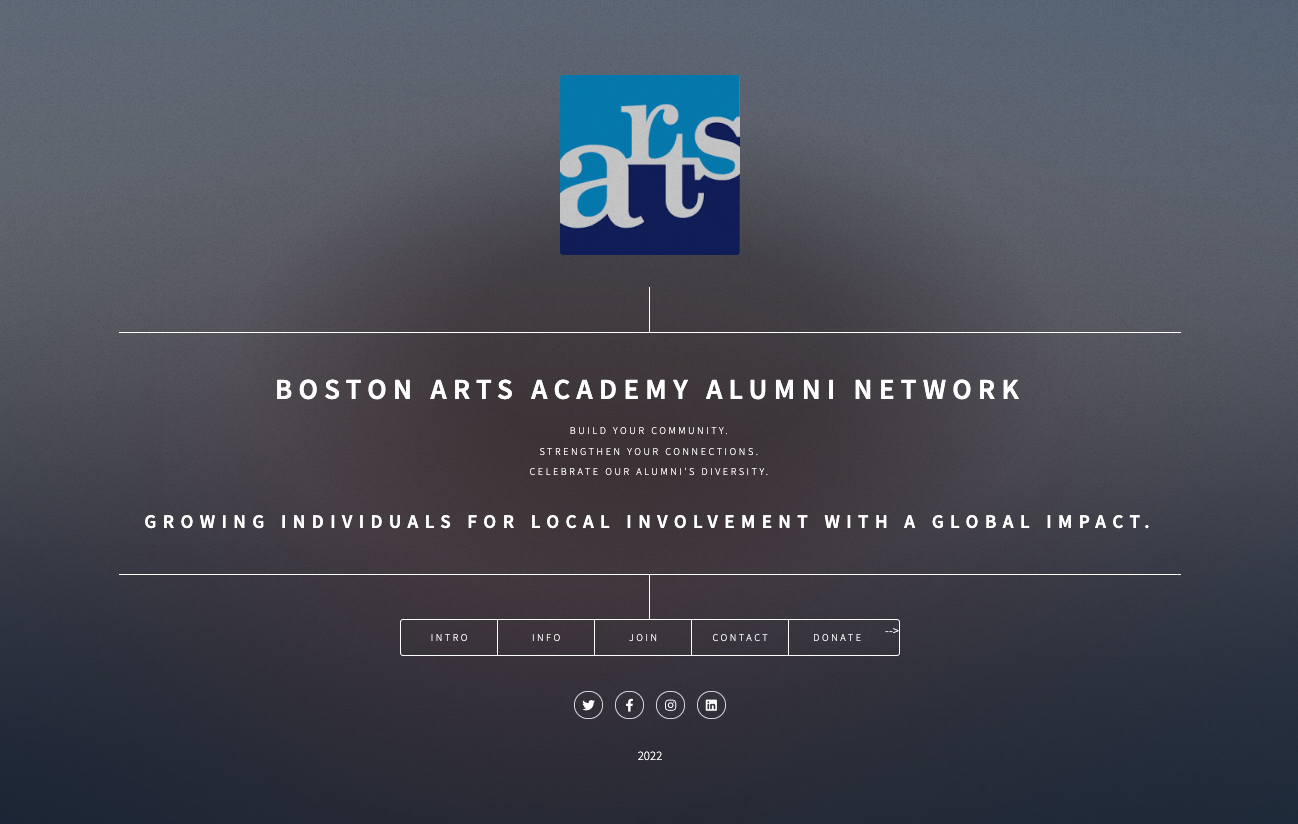
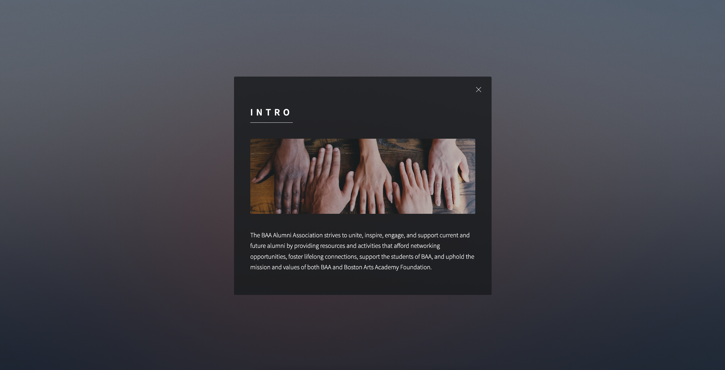
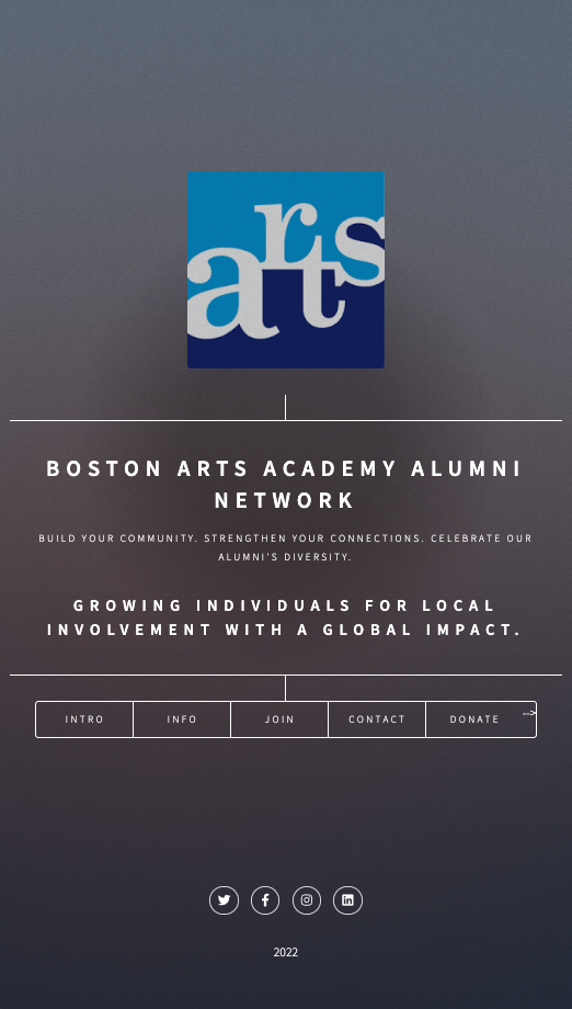
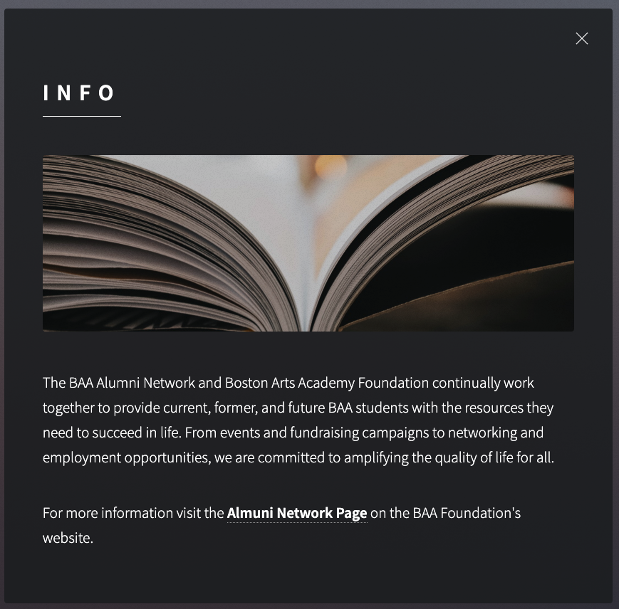
A very light weight solution for Boston Arts Academy: Foundation recently launched by Adam of LightDark, which is built from a google sheet and developed in a single page link tree. Can this flexible, scaleable, and inexpensive solution be one that works for your company or design problem?
An ingenious and lo-fi solution for Boston Arts Academy Foundation
A very light weight solution for Boston Arts Academy: Foundation recently launched by Adam of LightDark, which is built from a google sheet and developed in a single page link tree. Can this flexible, scaleable, and inexpensive solution be one that works for your company or design problem?

Motion Morsels - Branding
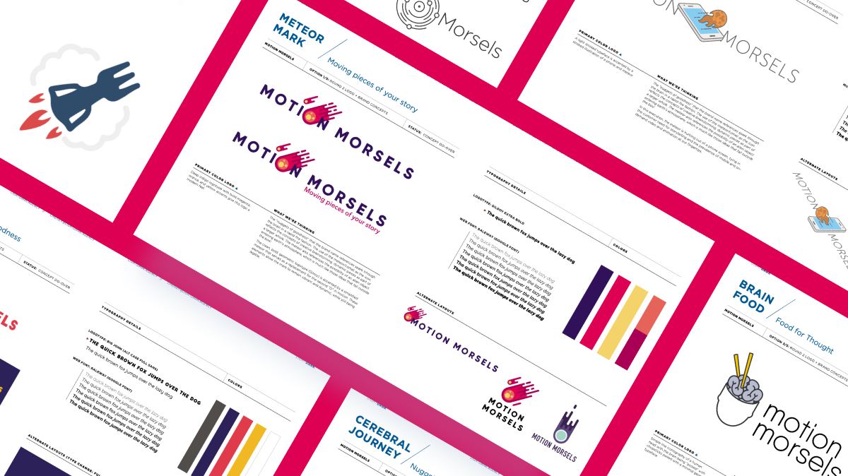
The "nuggets of goodness" that the brand name references spark though the brain
in a rapid-fire fashion. The use of the meteor/comet as the icon reflects the concepts of creative brainstorming, dynamic pieces as part of a larger whole. The meteor also references the possibility of an alien object entering earth's atmosphere, which is much like those ideas that fall outside the box!

SELECTED LOGO
THE CONCEPT
The "nuggets of goodness" that the brand name references spark though the brain
in a rapid-fire fashion. The use of the meteor/comet as the icon reflects the concepts of creative brainstorming, dynamic pieces as part of a larger whole. The meteor also references the possibility of an alien object entering earth's atmosphere, which is much like those ideas that fall outside the box!
The clean, bold, geometric logotype (Gilroy) is accented by a simplified meteor that serves as a replacement for the second "O" in motion. These elements allow the mark to remain vibrant and dynamic, while still being legible.


House of Findings

May May Inc. (House of Findings) | Freelance UX Designer
Brookline, MA, USA | Jul 2012 – Aug 2012
Approached to design an interactive About Us page to support the large team that makes up The House of Findings. The House of Findings is a retail boutique of collected vintage, global, and local artist products that is actively built by a large collection of artists and designers.
Explore our work by
select an archive filter by project solution type, who did the work (author), or year completed
Solution Type
- Art Direction 17
- Consulting 17
- Graphic Design 12
- Print 12
- Freelance 11
- Branding 9
- Digital Experience 9
- UX/UI 9
- Logo Design 7
- Very Small Business 7
- Custom Web Solutions 5
- Design Management and Production 5
- Project and Product Management 4
- Small Business BrandPack 4
- Animations and Prototypes 3
- Photography 3
- Presentation Design 3
- Design Strategy 1
- Ecommerce 1
- Physical Spaces 1