QCCF Branding
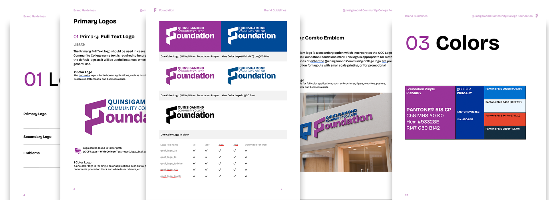
Branding effort for Quinsagamond Community College Foundation completed fall of 2025. LightDark Creative Agency was pleased to submit a proposal for the Quinsigamond Community College Foundation (QCCF) Brand Refresh. As a woman-owned creative studio based in Central Massachusetts, we specialize in branding for mission-driven organizations. We are excited by the opportunity to partner with QCCF in refreshing its visual identity to more effectively engage donors, alumni, and the broader community.
LightDark Creative Agency was pleased to submit a proposal for the Quinsigamond Community College Foundation (QCCF) Brand Refresh. As a woman-owned creative studio based in Central Massachusetts, we specialize in branding for mission-driven organizations. We are excited by the opportunity to partner with QCCF in refreshing its visual identity to more effectively engage donors, alumni, and the broader community.
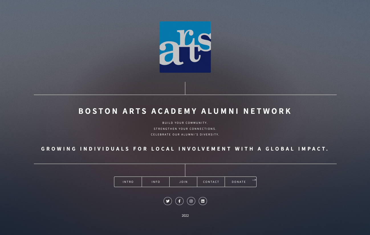
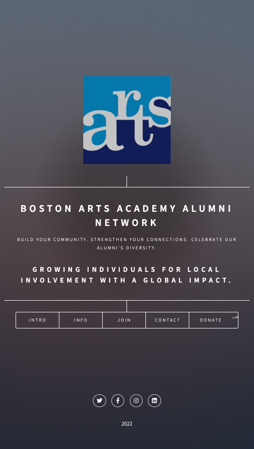
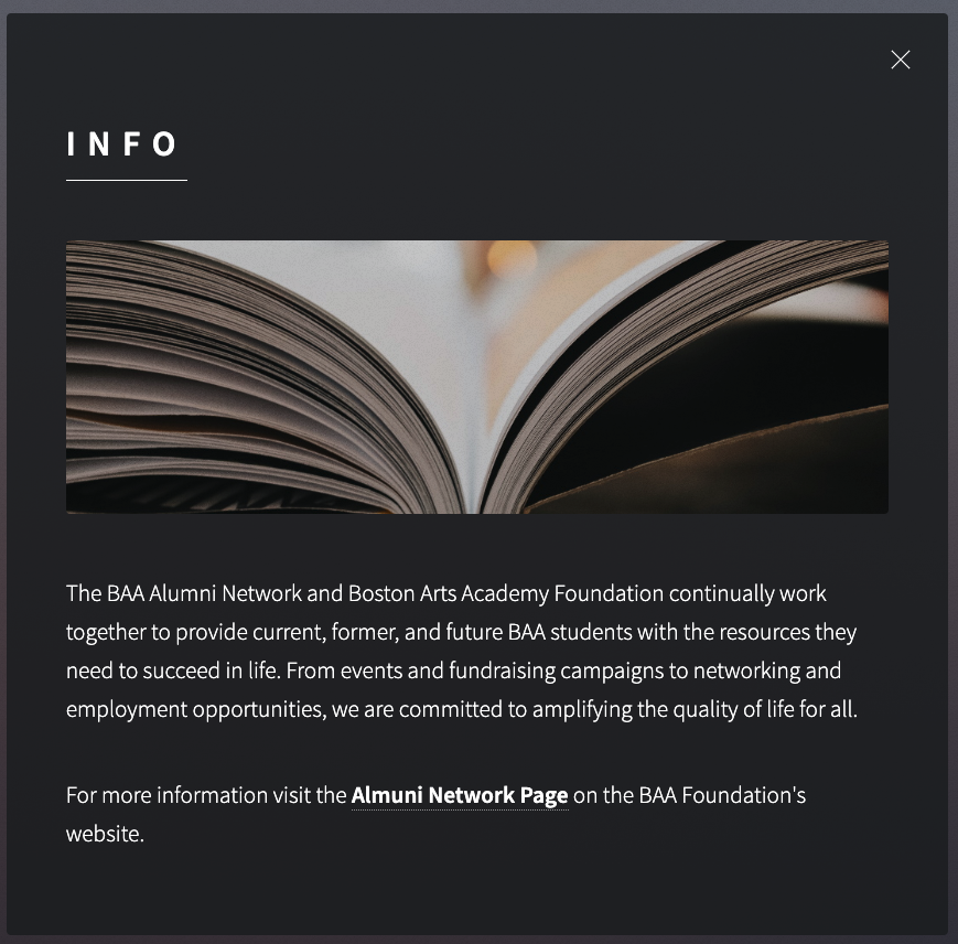
BAA Foundation | Link Tree, Custom Web Solution
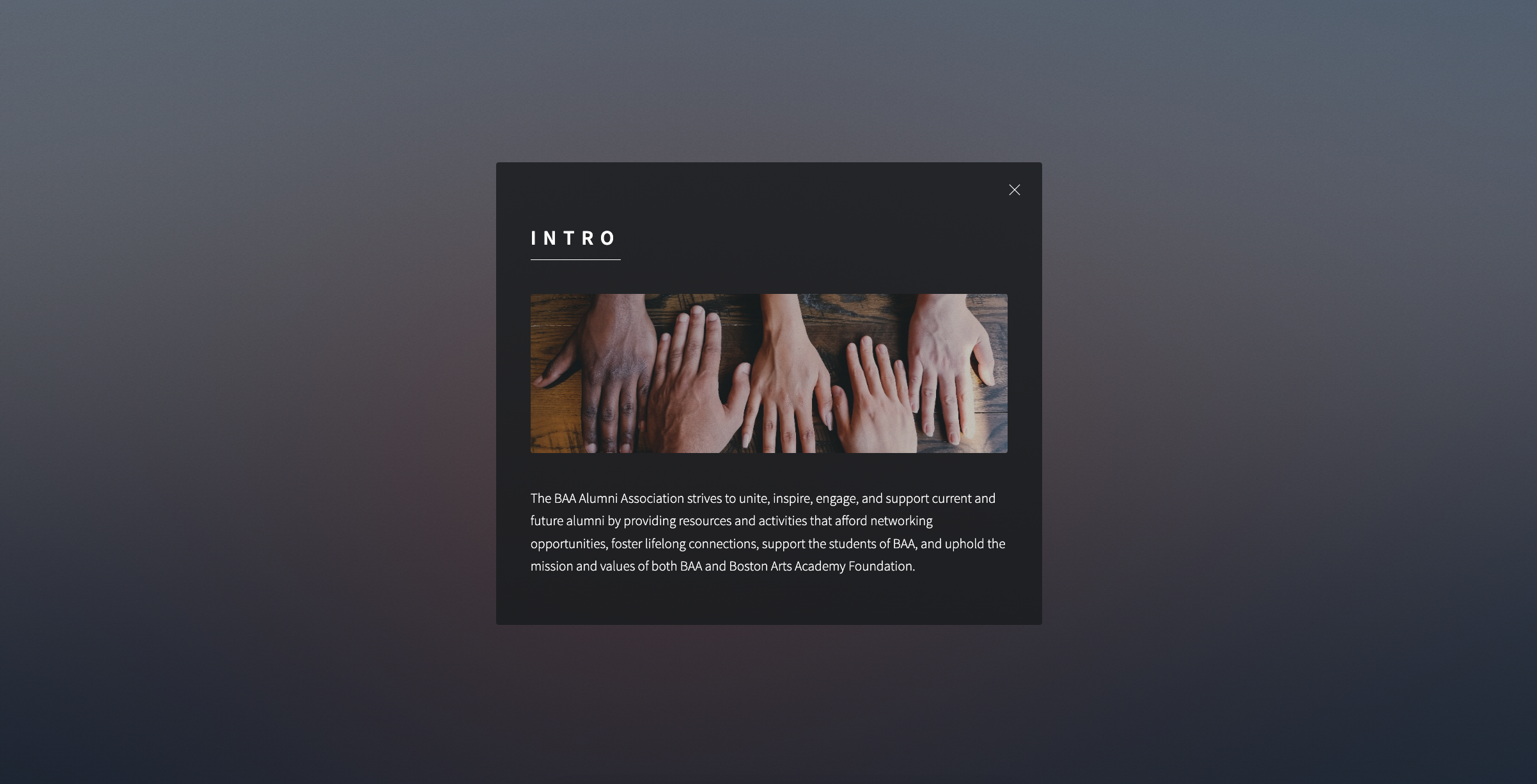
A very light weight solution for Boston Arts Academy: Foundation recently launched by Adam of LightDark, which is built from a google sheet and developed in a single page link tree. Can this flexible, scaleable, and inexpensive solution be one that works for your company or design problem?
An ingenious and lo-fi solution for Boston Arts Academy Foundation
A very light weight solution for Boston Arts Academy: Foundation recently launched by Adam of LightDark, which is built from a google sheet and developed in a single page link tree. Can this flexible, scaleable, and inexpensive solution be one that works for your company or design problem?
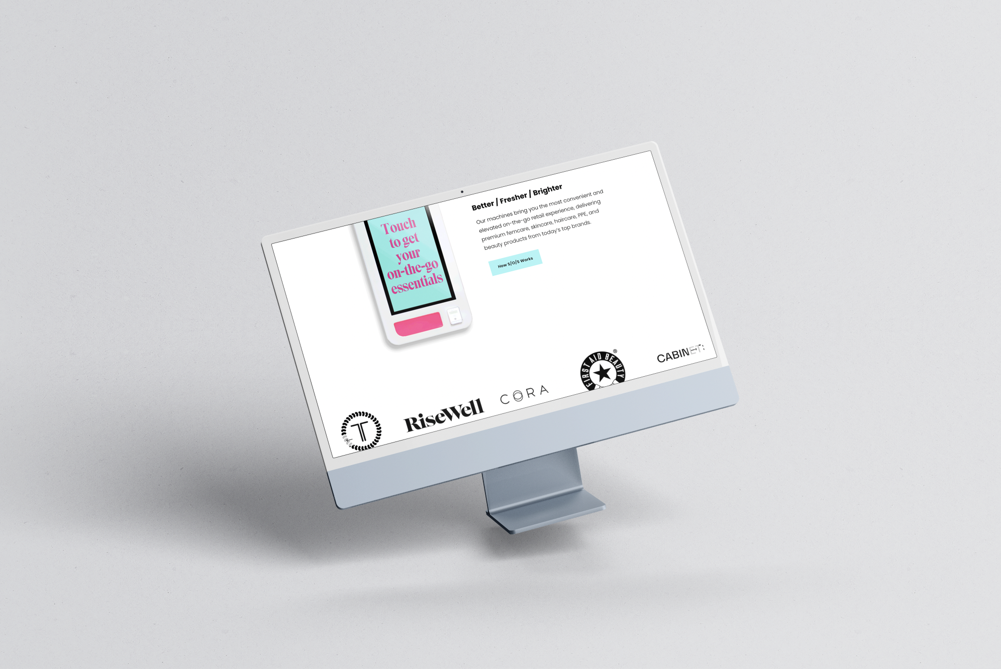
SOS Investor Decks and Communication
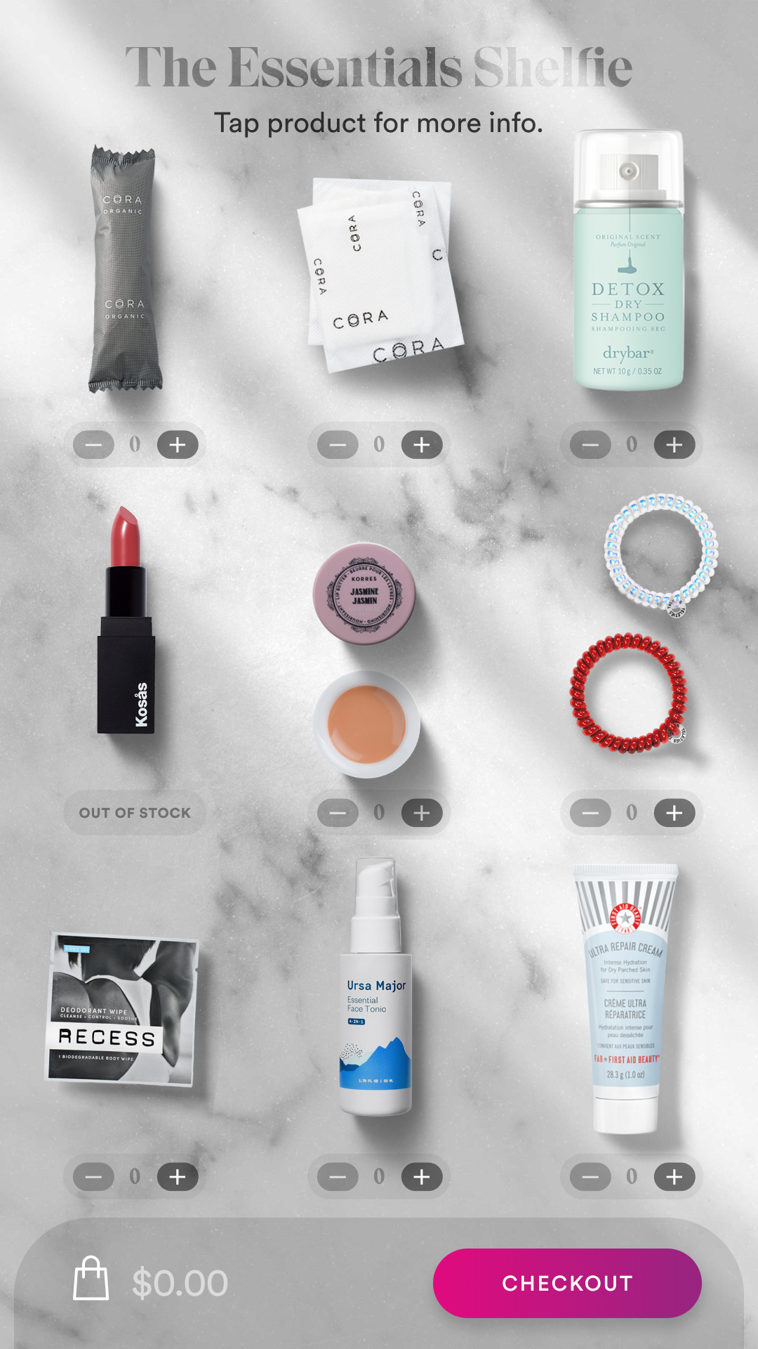
After being contacted by a TechStars company, I started working on digital vending machines using Figma for interface design. The client developed a machine that dispenses hygiene and beauty products and aimed to place it in large stores and train stations. They asked for my help in creating a website and improving the vending machine interface. My graphics and presentation materials were used in investor pitches to effectively showcase their product idea.
SOS Investor Consulting and Website Management
Figma / photoshop / principle / squarespace migration / investor deck ware /ui interface / art direction / brand consulting
After being approached by a TechStars churn out S/O/S, I quickly embraced the world of digital vending machines via Figma as an interface design tool. This client created a machine that dispenses famine hygiene and beauty products, and was going to market to be installed in big box stores and train stations, and requested my assistance in creating a website and enhancing the digital product vending machine interface. My elevated graphics and presentation materials were used in large investor pitches to really drive their wonderful product idea home.
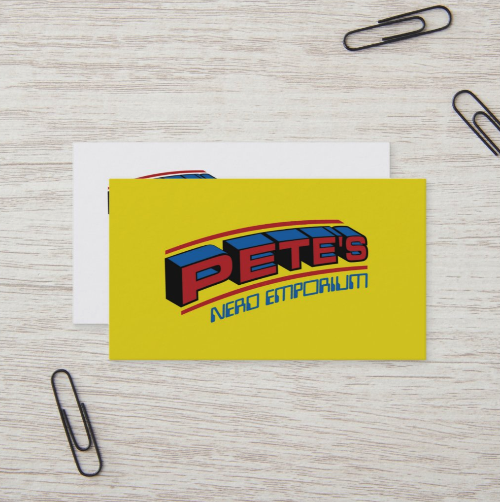
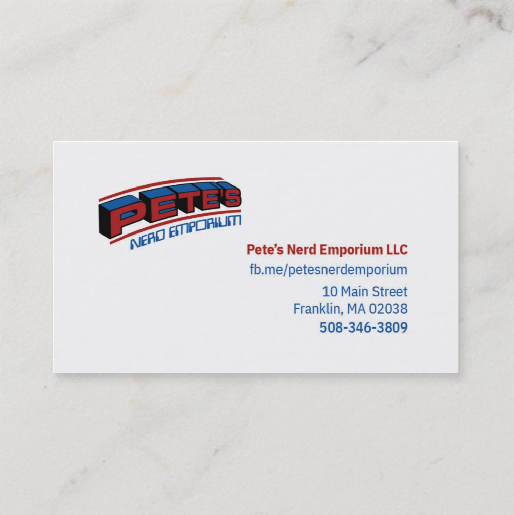
Pete's Nerd Emporium
Helped a small business out of Franklin, MA with various brick-and-mortar store design assets, as well as consulted on the facebook and online marketing leg.
Play professionals
Helped a small business out of Franklin, MA with various brick-and-mortar store design assets, as well as consulted on the facebook and online marketing leg.
Images from specs presented through Zazzle fulfillment of print-on-demand items
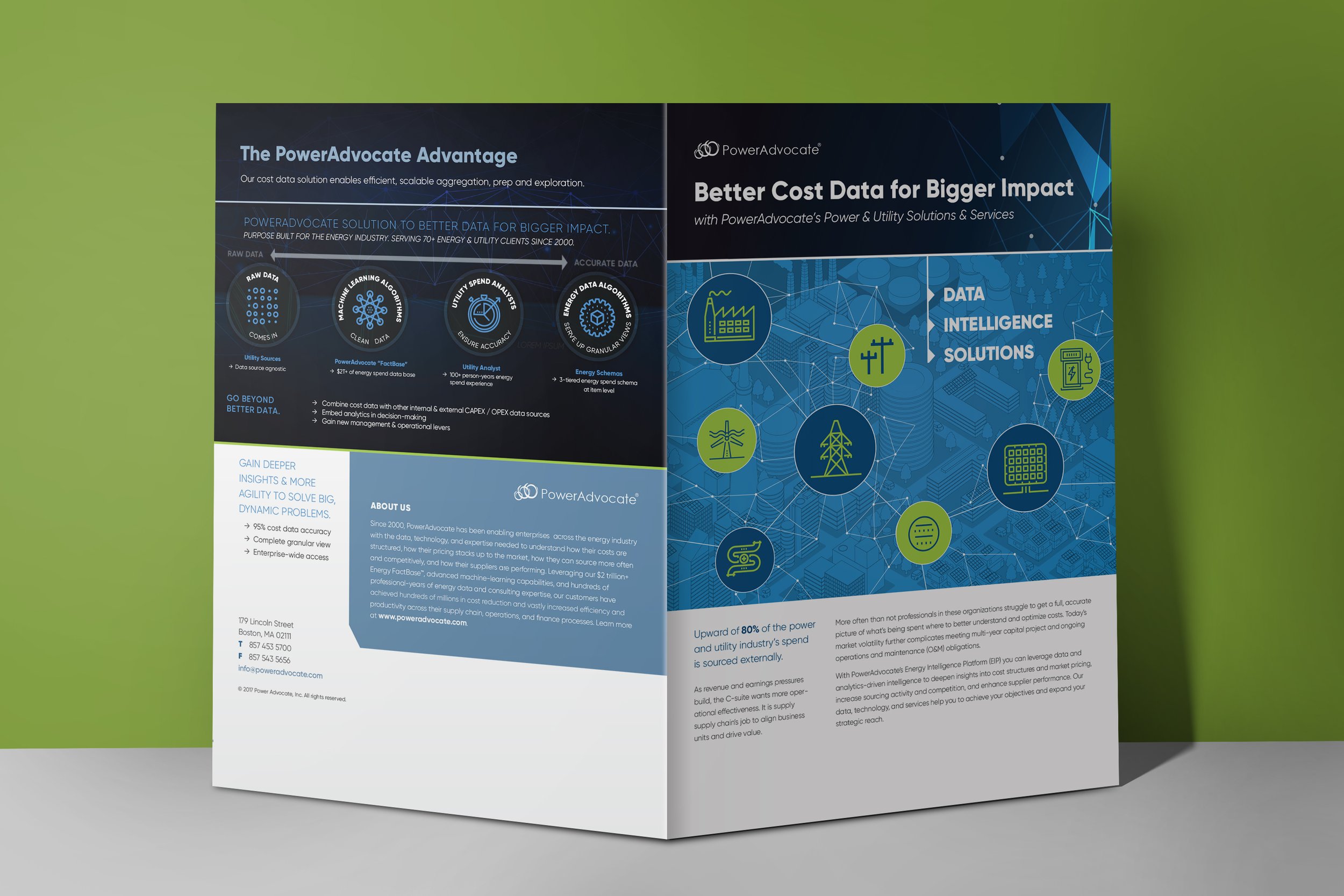
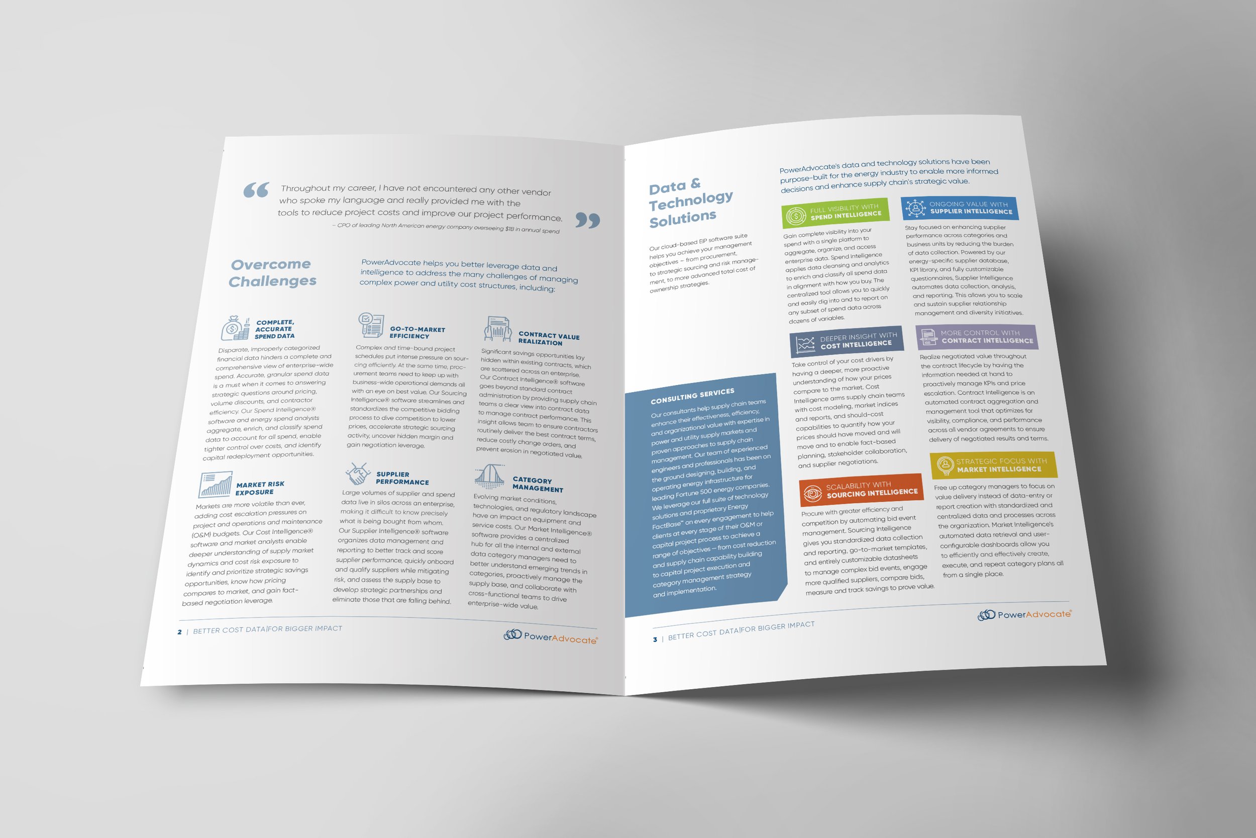
Power Advocate
Engagement time - 3 weeks
Worked remotely to produce some contracted work including a brochure, deck, animatic for screens behind demos, and other related campaign items.
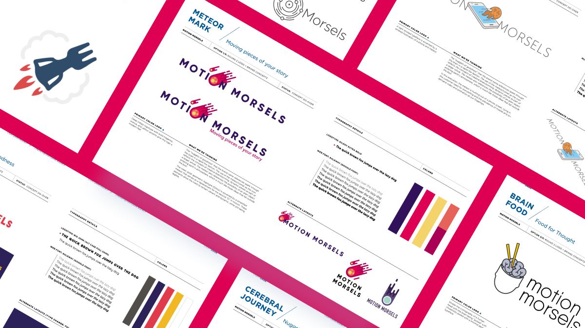
Motion Morsels - Branding
The "nuggets of goodness" that the brand name references spark though the brain
in a rapid-fire fashion. The use of the meteor/comet as the icon reflects the concepts of creative brainstorming, dynamic pieces as part of a larger whole. The meteor also references the possibility of an alien object entering earth's atmosphere, which is much like those ideas that fall outside the box!
SELECTED LOGO
THE CONCEPT
The "nuggets of goodness" that the brand name references spark though the brain
in a rapid-fire fashion. The use of the meteor/comet as the icon reflects the concepts of creative brainstorming, dynamic pieces as part of a larger whole. The meteor also references the possibility of an alien object entering earth's atmosphere, which is much like those ideas that fall outside the box!
The clean, bold, geometric logotype (Gilroy) is accented by a simplified meteor that serves as a replacement for the second "O" in motion. These elements allow the mark to remain vibrant and dynamic, while still being legible.
The Jungle Dream - Interior Spreads
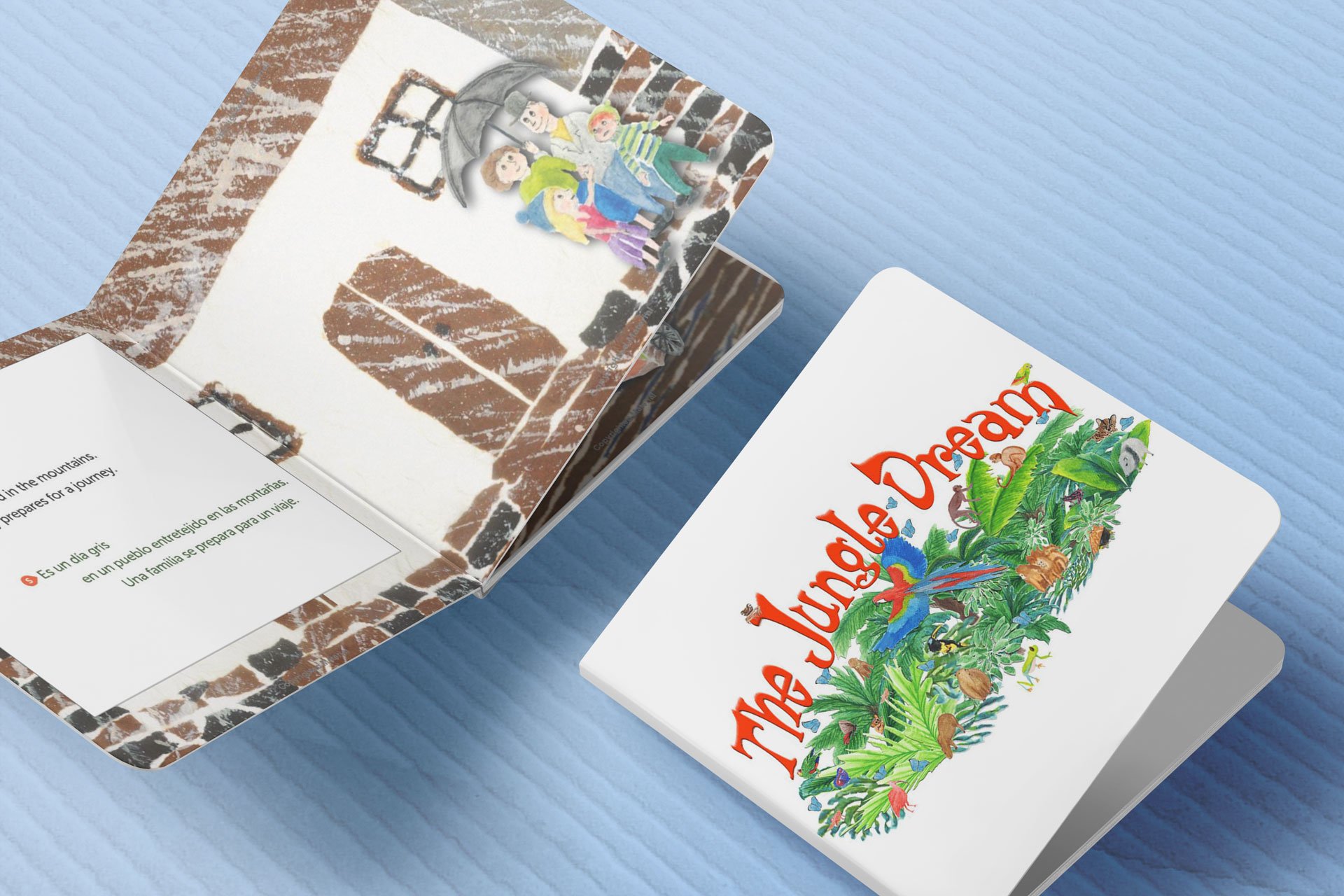
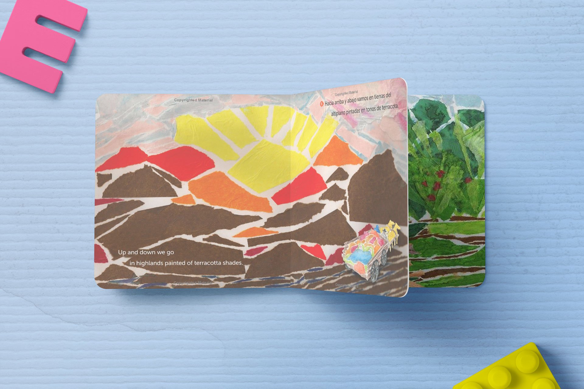
During the extent of this project, the designer (Lindsey Daniels) will create a 24-spread/48-page children’s book layout that will be ready for final print production upon completion of the project.
THE JUNGLE DREAM for MIRELIBOOKS
During the extent of this project, the designer (Lindsey Daniels) will create a 24-spread/48-page children’s book layout that will be ready for final print production upon completion of the project.
DELIVERABLES:
text format options for interior + 2-3 example interior spreads
book size options & selection
1-2 round revisions
Illustration file retouching
book cover resizing
final, print-ready file delivery
GENERAL PROCESS
Upon delivery of initial interior spread concepts (see project scope for detail), Miriam Bucheli will either: a) approve and select one of the interior page examples, including font, layout, size, or b) Miriam Bucheli will provide written feedback for Lindsey to discuss any desired changes, tweaks, or alterations.
This process will then lead to a round of revisions that will be returned for approval. Once layout is approved, Lindsey will continue to lay out the 48-page book to approved specifications and submit for final approval.
LightDark reserves the right to show any artwork, ideas, sketches created for this project in a portfolio as examples of client work. This can be during the project and also on completion. If you have any specific ‘secrecy/stealth mode’ requirements, please mention this before agreeing to the proposal, and we will adjust accordingly.
SERVICES
DISCOVERY
File collection and clean-up
Removal of text/box elements
Font exploration & layout options Book size options
Example spreads with font layout and style options
CREATIVE | ONCE ROUND 1 IS APPROVED
24-spread layout
Art/illustration retouchingAdding space to illustrations to fill spread Retouching for text overlay
Color Correction
Up-resing size for print
Revisions (1 round)
Revisions (2nd round-if necessary)
PRODUCTION | ONCE REVISIONS ARE APPROVED
Preflight & final assembly/check for printer
Adding & resizing final updated cover Soft proof (PDF) delivered for approval
Files delivered to printer in preferred method
Printing consulting
For paper types, talking with printer (if necessary)
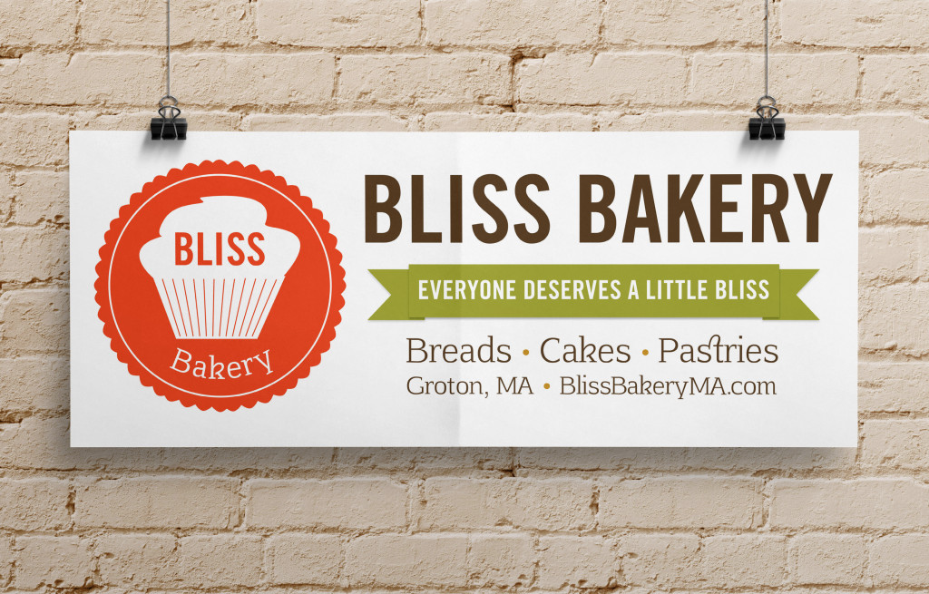
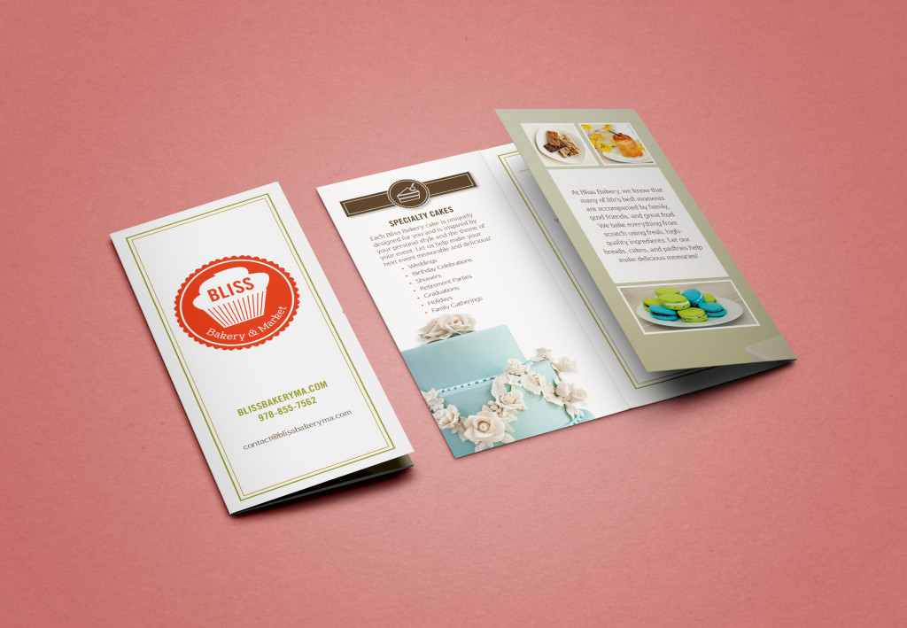
Bliss Bakery & Market
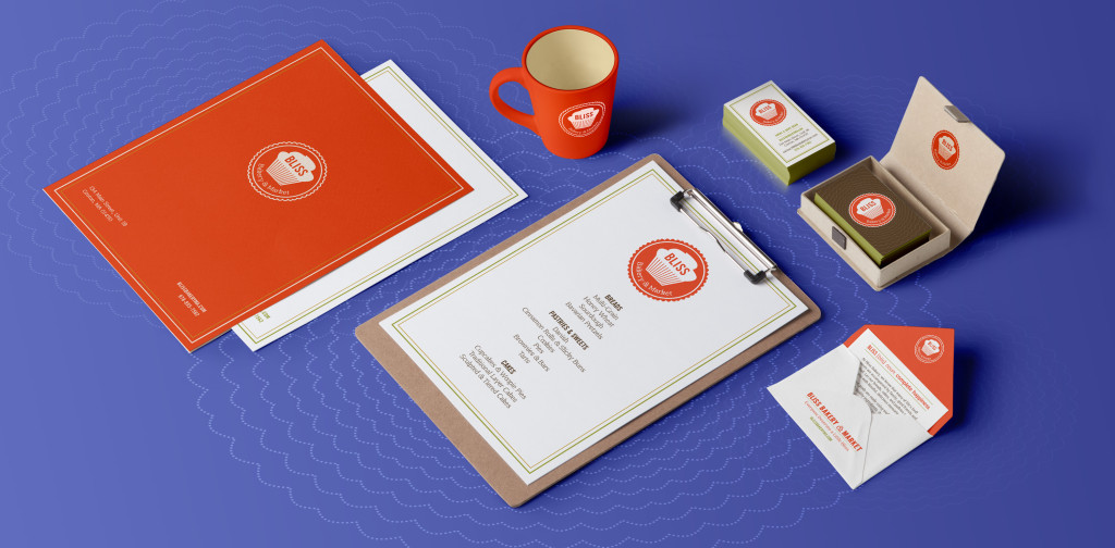
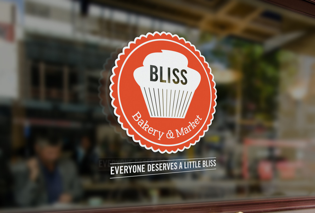
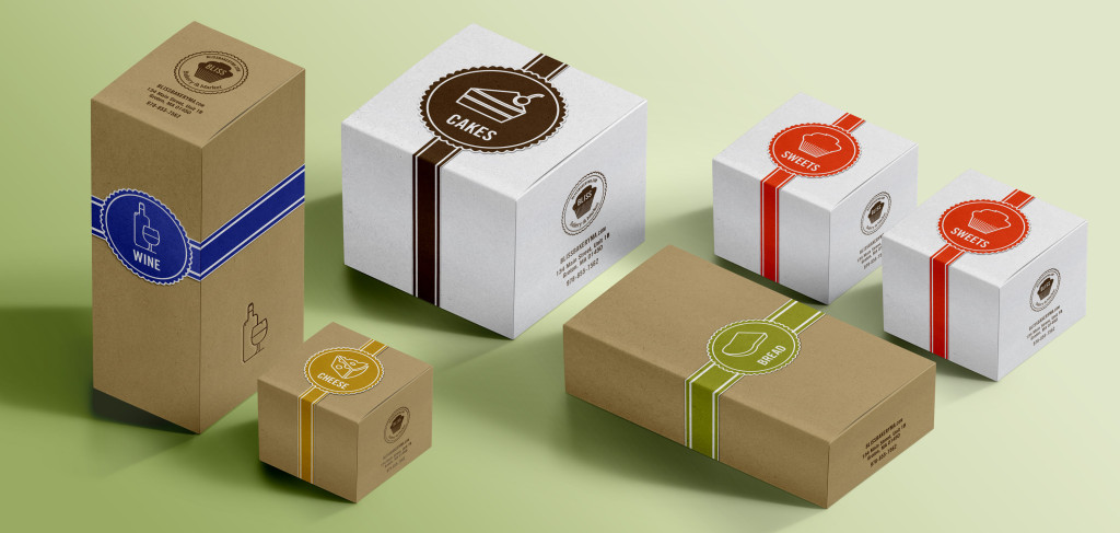
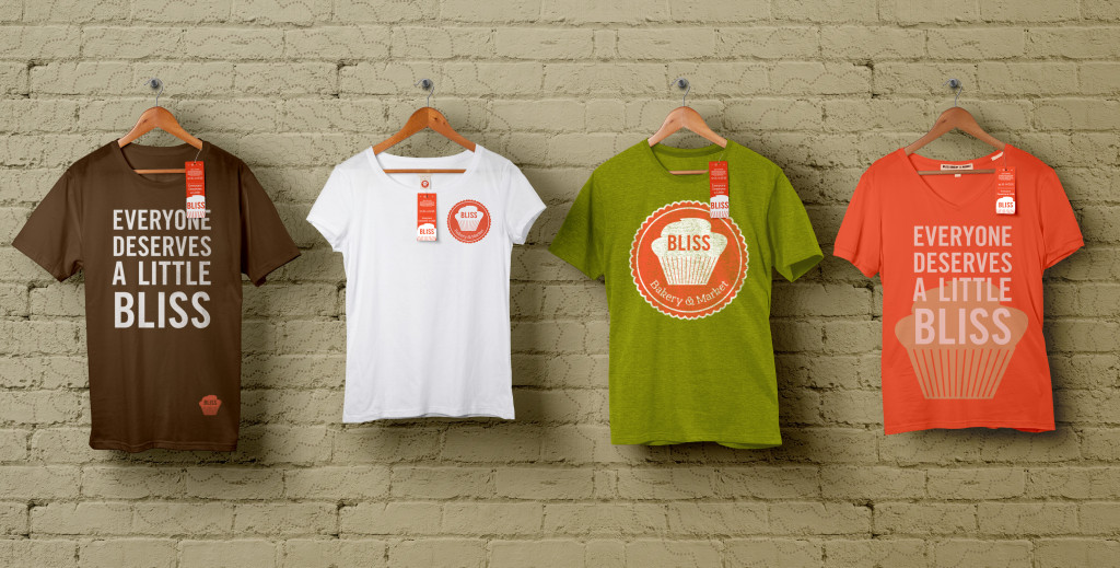
Bliss Bakery is a small at-home bakery run by Sheri Dean and an excellent example of our small business brand identity quick-start package service offering (it’s a mouthful, we are working on the name). She asked me to give the brand a new image, starting with the logo and branding guidelines, and ultimately it was built out into a website.
House of Findings
May May Inc. (House of Findings) | Freelance UX Designer
Brookline, MA, USA | Jul 2012 – Aug 2012
Approached to design an interactive About Us page to support the large team that makes up The House of Findings. The House of Findings is a retail boutique of collected vintage, global, and local artist products that is actively built by a large collection of artists and designers.
Explore our work by
select an archive filter by project solution type, who did the work (author), or year completed
Solution Type
- Art Direction 17
- Consulting 17
- Graphic Design 12
- Print 12
- Freelance 11
- Branding 9
- Digital Experience 9
- UX/UI 9
- Logo Design 7
- Very Small Business 7
- Custom Web Solutions 5
- Design Management and Production 5
- Project and Product Management 4
- Small Business BrandPack 4
- Animations and Prototypes 3
- Photography 3
- Presentation Design 3
- Design Strategy 1
- Ecommerce 1
- Physical Spaces 1


