
Kaspersky Labs
Graphic Design Experience: Kaspersky Lab
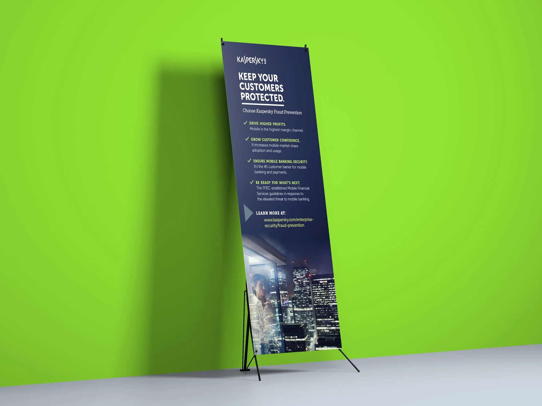
Operated on a small team as a senior designer supervising junior designers. Worked within existing brand guidelines on various media types including print and digital marketing materials, video and collateral design, event materials, infographics, and lead generation campaigns.
Senior Graphic Designer
Operated on a small team as a senior designer supervising junior designers. Worked within existing brand guidelines on various media types including print and digital marketing materials, video and collateral design, event materials, infographics, and lead generation campaigns.


Motion Morsels - Branding
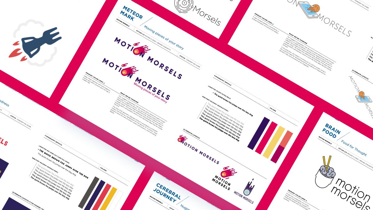
The "nuggets of goodness" that the brand name references spark though the brain
in a rapid-fire fashion. The use of the meteor/comet as the icon reflects the concepts of creative brainstorming, dynamic pieces as part of a larger whole. The meteor also references the possibility of an alien object entering earth's atmosphere, which is much like those ideas that fall outside the box!

SELECTED LOGO
THE CONCEPT
The "nuggets of goodness" that the brand name references spark though the brain
in a rapid-fire fashion. The use of the meteor/comet as the icon reflects the concepts of creative brainstorming, dynamic pieces as part of a larger whole. The meteor also references the possibility of an alien object entering earth's atmosphere, which is much like those ideas that fall outside the box!
The clean, bold, geometric logotype (Gilroy) is accented by a simplified meteor that serves as a replacement for the second "O" in motion. These elements allow the mark to remain vibrant and dynamic, while still being legible.


aspire by RiteAId
Serving as art director/designer, my team worked with a well known pharmacy to develop the strategy, branding, and asset roll out of their internal health benefits and consumer "minute-clinic" program roll out. Working with a shared consultant contact (which provided the "white label" program assets) for the consumer-facing, more accessible in-store clinic for which we created program names, brand visuals and identity, online portal designs for both the internal employee benefits and consumer-facing marketing campaigns and online communications. This initiative was a new addition to the client, so we were tasked to create awareness for this in-store service as well as the UI component guidelines.
Serving as art director/designer, my team worked with a well known pharmacy to develop the strategy, branding, and asset roll out of their internal health benefits and consumer "minute-clinic" program roll out. Working with a shared consultant contact (which provided the "white label" program assets) for the consumer-facing, more accessible in-store clinic for which we created program names, brand visuals and identity, online portal designs for both the internal employee benefits and consumer-facing marketing campaigns and online communications. This initiative was a new addition to the client, so we were tasked to create awareness for this in-store service as well as the UI component guidelines.
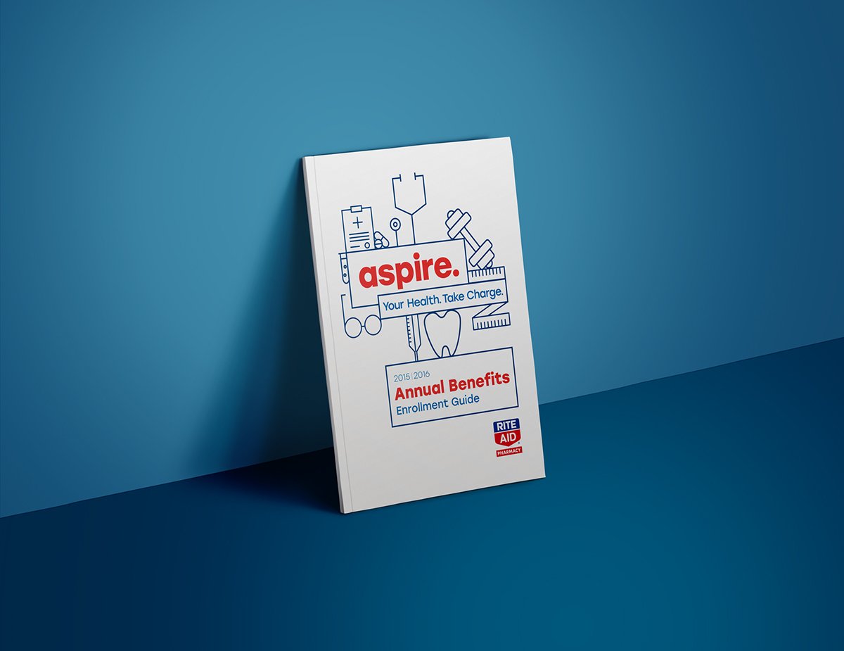
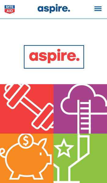
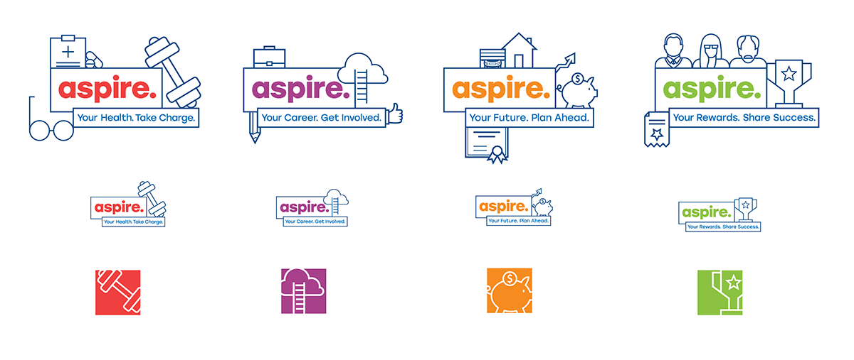
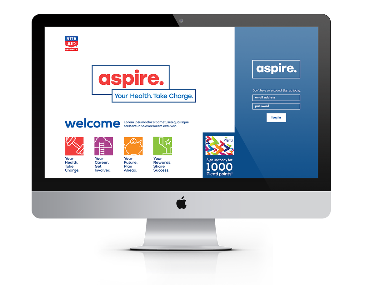
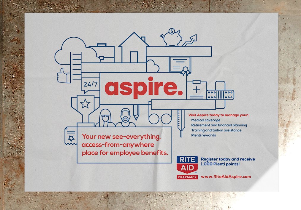
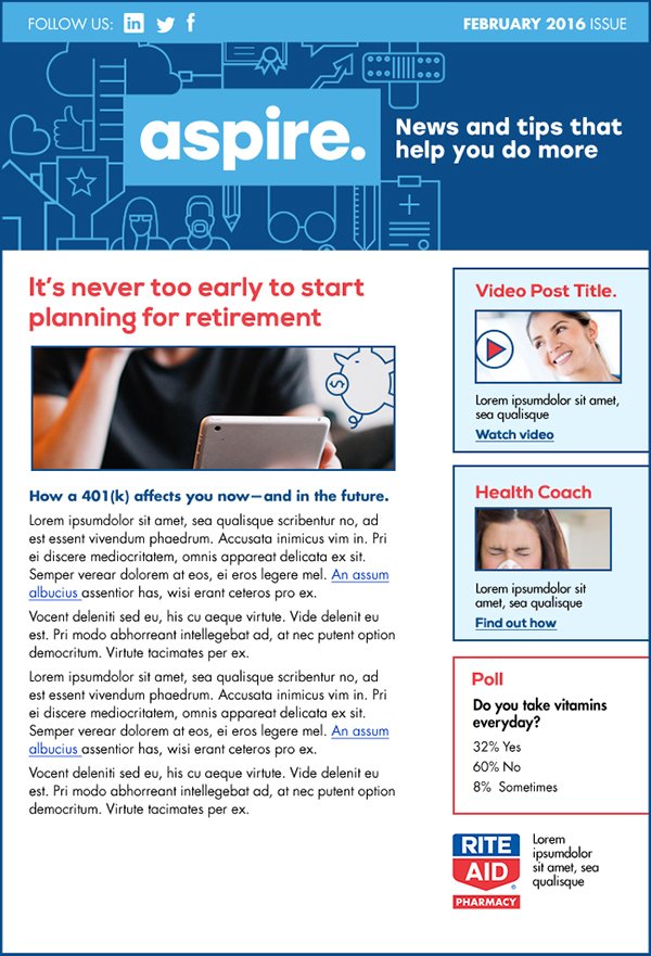
All work done was completed under the title of art director at CommCreative (Commonwealth Creative Associates) and rights belong to Rite Aid.

Alere
Developed a branded brochure system for upcoming trade show to accommodate four new products. System included flexible, multi-level, print layout templates to flex to fit content ranging from long passages, information graphics, call outs, captions, and bulleted lists. System also included multiple cover options both with photographs and purely typographic/color based.
Developed a branded brochure system for upcoming trade show to accommodate four new products. System included flexible, multi-level, print layout templates to flex to fit content ranging from long passages, information graphics, call outs, captions, and bulleted lists. System also included multiple cover options both with photographs and purely typographic/color based.


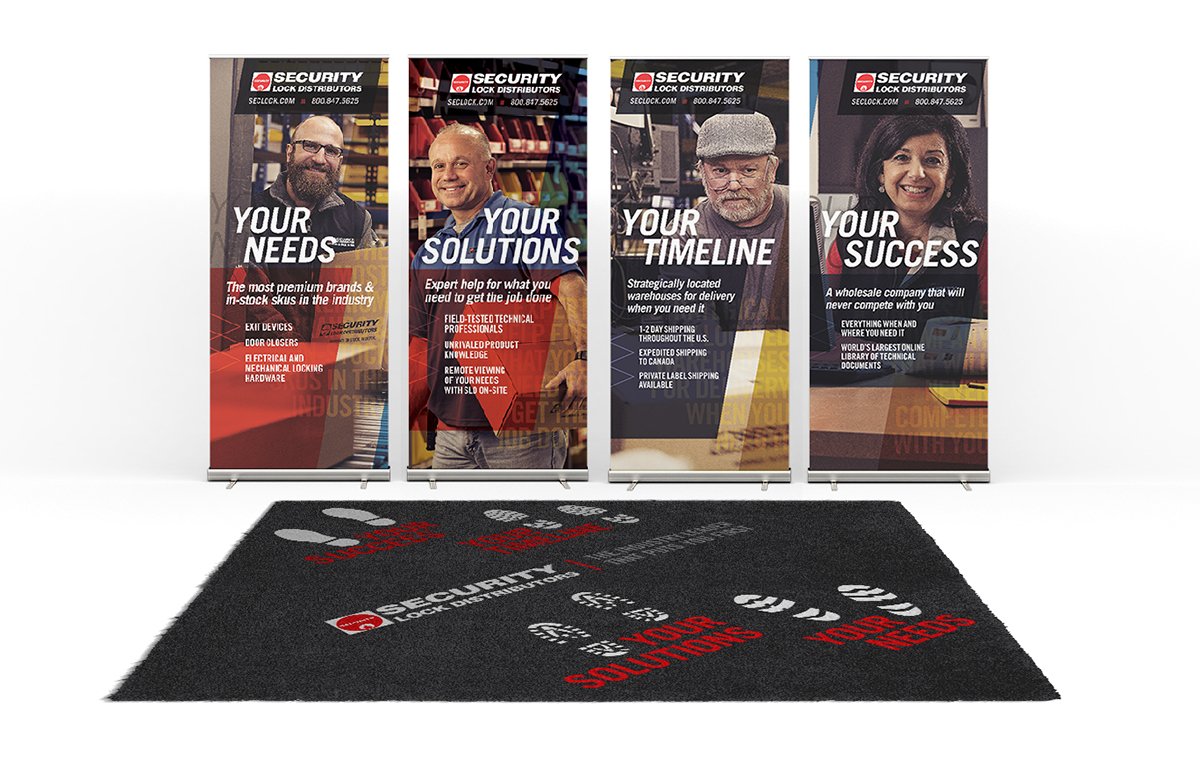
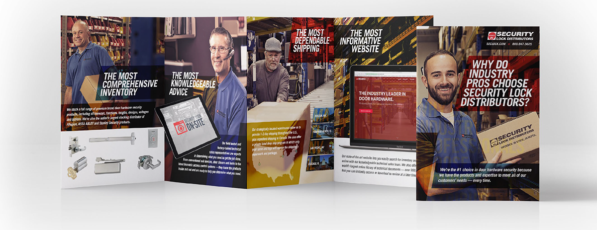
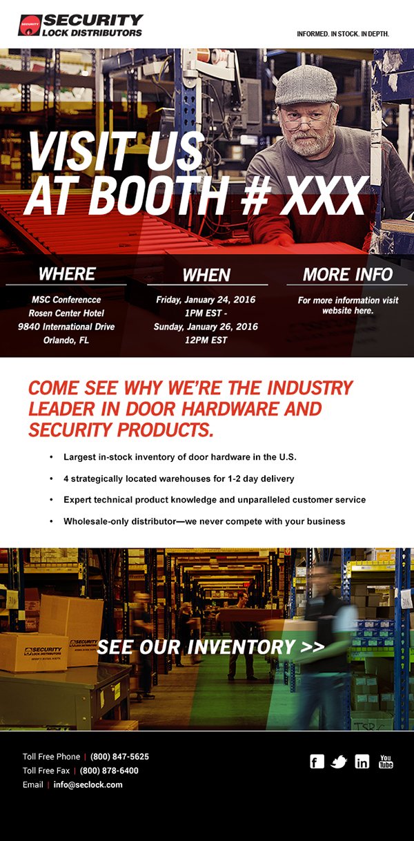
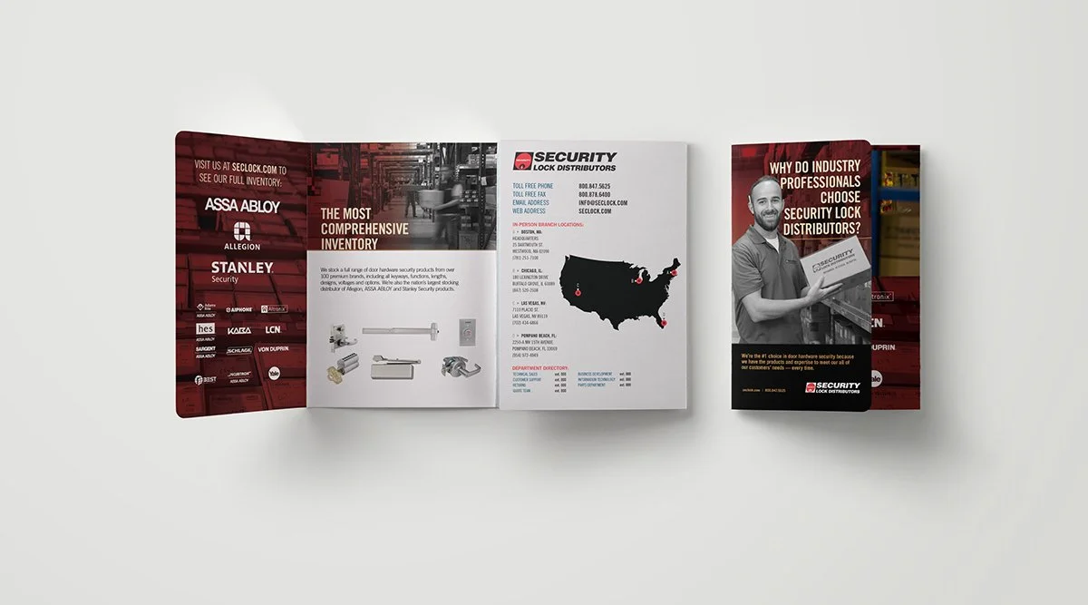
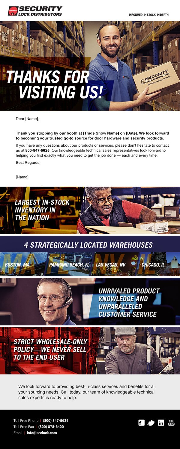
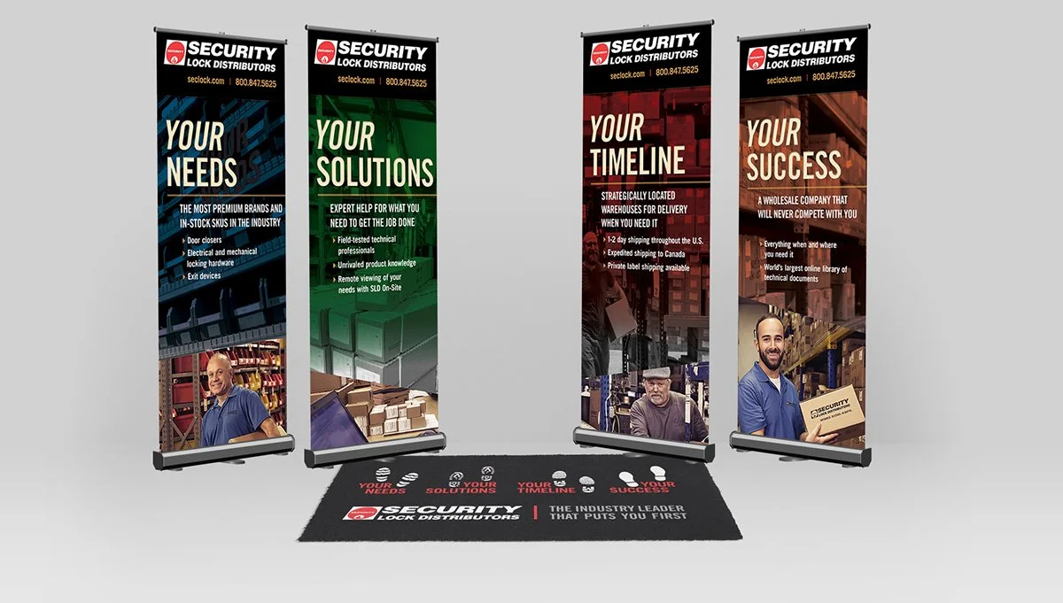
Security Lock Distributors: Trade Show
Working as Art Director with CommCreative, my role was to art direct and assist with styling during in-warehouse photoshoot for lock distribution client, in addition to carrying forward their brand guidelines defined by our agency and create trade show, email, and printed collateral to go along with this campaign.
Working as Art Director with CommCreative, my role was to art direct and assist with styling during in-warehouse photoshoot for lock distribution client, in addition to carrying forward their brand guidelines defined by our agency and create trade show, email, and printed collateral to go along with this campaign.
2016 - Rights reserved by CommCreative and Security Lock Distributors, respectively.
Explore our work by
select an archive filter by project solution type, who did the work (author), or year completed
Solution Type
- Art Direction 17
- Consulting 17
- Graphic Design 12
- Print 12
- Freelance 11
- Branding 9
- Digital Experience 9
- UX/UI 9
- Logo Design 7
- Very Small Business 7
- Custom Web Solutions 5
- Design Management and Production 5
- Project and Product Management 4
- Small Business BrandPack 4
- Animations and Prototypes 3
- Photography 3
- Presentation Design 3
- Design Strategy 1
- Ecommerce 1
- Physical Spaces 1